notes from san francisco: testing 1‑2‑3
6 May 2009, 06:39
This second blog posting about the openPrinting summit in San Francisco covers the usability testing of the printing dialog. First, a few words about usability testing.
I have worked with people who saw a usability test as a kind of final school exam: better send something into the test that will not rock the boat. This kind of fear surely stamps out any kind of interaction design innovation. Under those circumstances I say: why bother doing this project at all?
hard knocks
Experienced software developers appreciate working with a dedicated software test team. Yes, these testers aim to take everything apart, but the resulting software will be a lot better when it hits the streets. Similarly, I enjoy working with a usability team.
The usability test delivers hard‐hitting facts, but these flow straight into debugging and adding depth to my interaction designs. And when the test says it works, then my work is validated and that marks the end of doubt and discussion.
before the test is already a test
The usability test was performed by Jan Mühlig of relevantive, who also headed up the first involvement of openUsability with openPrinting in Atlanta, 2006. Although I took over the project at the Lexington summit in the same year, Jan has been closely involved at different phases of this project.
Straight away the preparation meeting was a hoot. For interaction architects, having a frank, uncomplicated discussion with professionals who have empathy and usability experience is both a pleasure and highly valuable. Jan’ feedback triggered a redesign that Kate, my associate at m+mi works, and I performed during our preparation of the test material.
agile like paper
The test was performed using a paper prototype. I played ‘computer’ in most of the test sessions, driving the dialog response to users’ input. Working this way allowed us to do three rounds of testing—with in between two further rounds of redesign—in exactly six days.
Being a usability researcher, Jan was not going to take for granted that any of our big, innovative concepts—no matter how sound they looked—was simply going to work. ‘Just print’; two levels of detail in the dialog; always a preview; quick presets; parameter tagging: he gave all of them a real workout during the tests. They had to prove to be a real improvement over the current state of printing dialogs.
the results are in
Walking you through the results, I will illustrate them with the latest iteration of the design, the one that went into the third test.
‘just print’
Printing still does not exist. At the start of test the participants were interviewed about what printing means to them and how they experience it. Again and again the answer is that the act of printing is not interesting, only the result counts. Here are some quotes:
‘What I think about is hard‐copies, really; a piece of paper I can look at.’
‘…but most often, I’ll just press print.’
‘I just click on print and… —[Jan:] the print appears by magic? —Yes.’
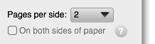
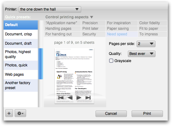
Although ‘printing does not exist’ is our number one guiding principle, it is striking to experience in the test how strong this force is. Our solution for supporting this is ‘just print,’ bypassing the print dialog altogether. Below you see the jury‐rigged file menu we used in the test:
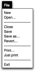
I had put ‘Print one copy’ as a label in there for ‘Just print’ in the first test, but that did not work out. So, if you want to learn something, take some risk and use the test results. From the second test on the menu was as above. It fared better, but more testing is needed here before setting this label in stone.
preview
If ‘printing does not exist’ is a strong force, the print preview is huge. We are not talking here about participants getting along nicely with the preview and they knowing how to flip trough it. We are talking about seeing that for 100% of the participants the preview addresses a fundamental need.
Although it was my vision right from the beginning to design the print dialog around the preview, it is still amazing for me to see in the tests how deep it has an effect on users. So deep, that participants of the ‘just print’ persuasion started going through the print dialog more after seeing it—and the preview—only once. It is a huge effect to have the voodoo taken out of printing.
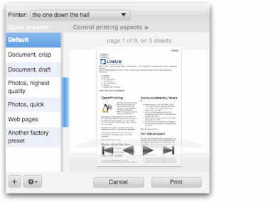
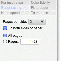
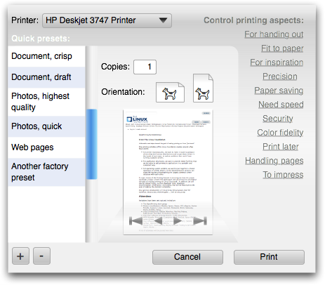
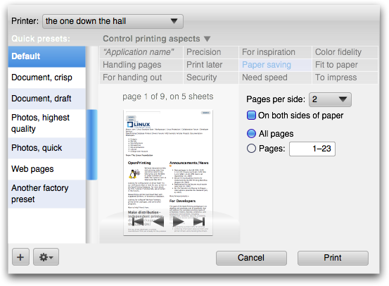
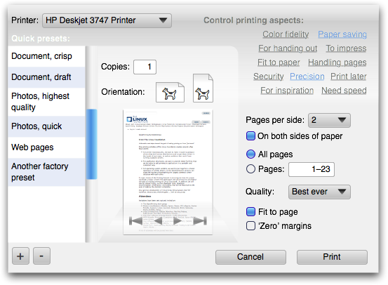
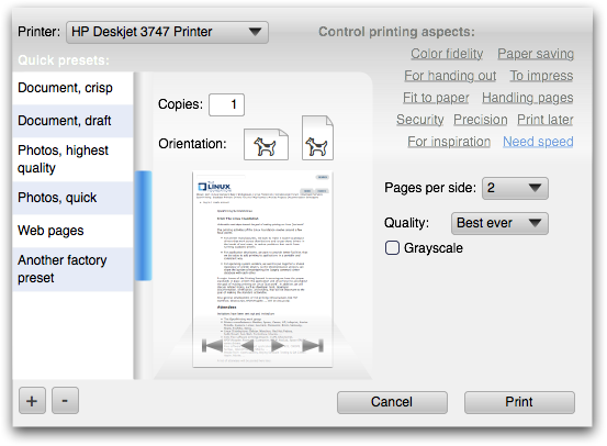
Now as an interaction architect I expect that long‐term—after the printing dialog has built a new level of trust in the print process through the preview and other factors—users will start taking up the offer to ‘just print’ for boring, predictable print jobs. But at any moment: if there is a hint of doubt, then the preview rules. Below we see the preview in the compact, level 2 dialog:
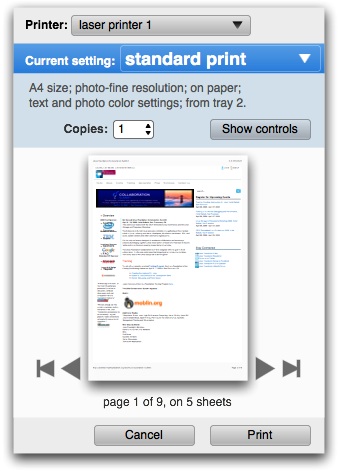
We added to this level the only universal printing parameter in the world: number of copies. If there is one thing we learned from this whole test cycle is that the way to the print is through the preview. The preview is the last thing to check and the Print button is logically located just below it.
tagging
Because of a lucky labelling flaw in our test set‑up, all the test participants went through the situation where the first tag they chose did not deliver the printing parameter they were looking for. After selecting a second tag they did not get the familiar situation of seeing different parameters, they got more of them (all parameters referenced by both tags). Then in 100% of the tests the conversation was the following:
Jan: Is this surprising?
Participant: Yes.
J: is it negative or positive?
P: I think it is positive, it is good that these are shown together because […].
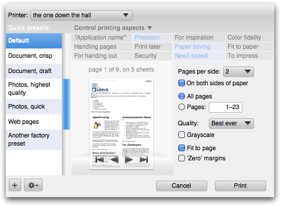
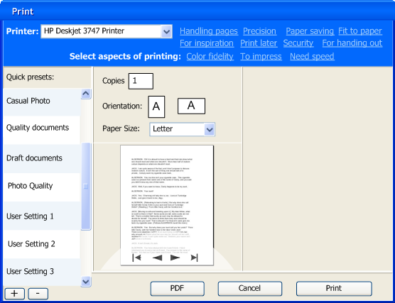
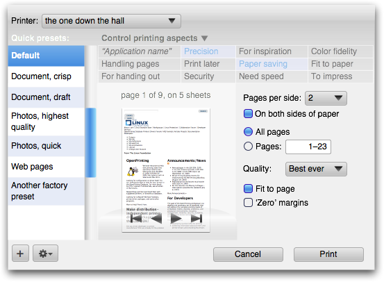
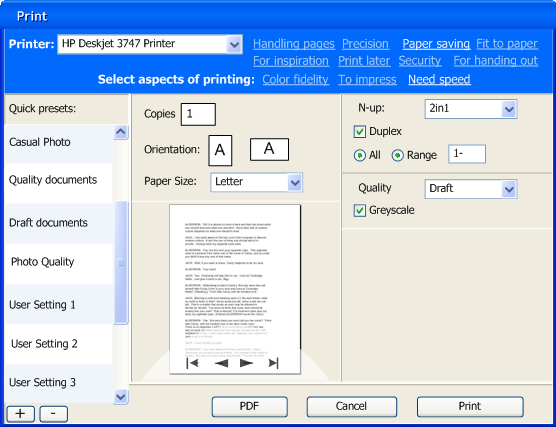
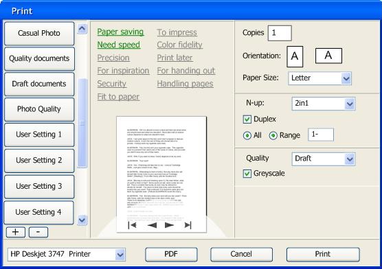
Every participant formulated the last answer in a different way, citing a different reason why it was an improvement. But it was striking how the pattern returned in every test. Based on that Jan declared that he does not have to see dozens of tests more to know whether it works, it simply does. Below we see the full‐fledged level 3 dialog:
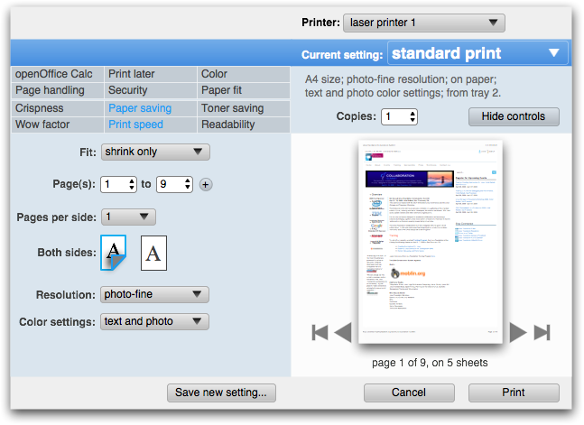
The whole tags + parameter section functions as an extension of the level 2 dialog. What is new is that the tags are now sectioned, along the lines of old‐fashioned functional vs. new user needs. Twelve of them in a single grid was simply too much. Next up for us is a parameters on the left vs. on the right design exercise and further work on the individual controls.
trouble
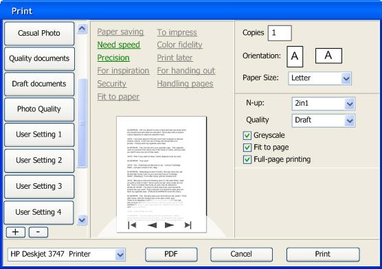
Not everything went that smooth from the beginning. I will illustrate that with this level 2 dialog that went into the first test (thus, now an obsolete design):

The test showed the following problems:
- participants had trouble identifying what the quick presets (on the left in the dialog) really were: a preset controlling all parameters or a single parameter settings?
- participants had trouble getting to level 3 in the dialog (via the More control button);
- participants were looking to ‘open up’ a quick preset to show what the actual implications (parameter settings) of it were;
- participants were looking to ‘open up’ a quick preset to show the printing parameters.
To find out what was going on we did a full‐risk redesign for the second test. That fared even worse. But now we knew what was going on:
- we were relying on the actual labelling of the quick presets to communicate what they actually were;
- our labelling was not good enough and since in production the real labels will be supplied by the printer manufacturer, they will never be perfect;
- the preview does not contain enough information to show what a quick preset completely entails;
- the information structure in the dialog was not clear: we were not showing that a quick preset encapsulates a full set of parameter values and thus the whole print.
into the light
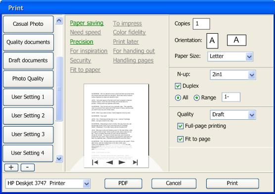
To see how we solved this puzzle, let’s have a look again at the level 2 dialog that went into the third test:
The quick preset—now called ‘Current setting’ for users—now serves as a banner for everything but the printer. Under it, what is an essential print setting and not ascertainable from the preview is listed in short‐hand for a more complete overview what a quick preset will accomplish.
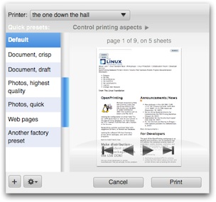
Furthermore, a change that meant the end of a principle that I had long cherished for the dialog: visibility and 1‑click selection of quick presets. With the limited reliability of quick preset labelling, the visible listing of them has limited value. Making the choice of quick preset a pop‑up enables to run it as a banner, closing the circle.
This design tested well in the third test. This means the big concept bugs have been debugged and fixed. For the actual quick preset pop‑up I have some innovative ideas in mind that I want to see explored. If they ever make it into the design, they sure will need usability testing, of course.
encore: labelling insights
While preparing for the first test, we spend some time straightening out the tagging used in the dialog. There we discovered some subtle factors in the labelling. Some of the tags had labels that looked like an end‑goal (‘fit to paper’), instead of a range where users can find their own optimum (‘paper fit’). The former gives the impression of a quick preset and is thus incorrect.
Similarly we have seen that quick presets can give the impression to be a single parameter setting. Although users have every right to store such ‘single issue’ presets, factory‐shipped presets should target broader goals and be labelled as such. ‘duplex: on’ is a very bad preset label, ‘good enough for jazz’ is a good label.
That’s it for dialog usability testing. Next up: the trouble with infrastructure.
Labels: design stage, openPrinting, practical

notes from san francisco: pdf
27 April 2009, 23:36
Two weeks ago, I presented about the ongoing work on the printing dialog at the openPrinting summit in San Francisco. Some of that was an overview of what had happened since Montreal, that you could already read about here.
Three distinct topics formed the new and notable in my talk, I will present them here in three separate blog entries. First up, a topic long overdue.
what about pdf?
As part of the second season of usability project for openPrinting we had a closer look at generic pdf creation, because it is handled via the printing dialog on all main desktop platforms. First, we found out why engineers were tempted to implement it in that way.
Another factor became clear when we looked at under what circumstances does it make sense to create a pdf from an application. Answer: if it is worth printing, it is worth making a pdf of. So if it walks like a print job and quacks like a print job, why not represent it like a print job?
a spanner in the works
There is one slight problem: users won’t have it. No matter how long it has been the norm to create a pdf via the print dialog, they have no idea why it is ‘hidden’ there. To them it feels as printing via the ‘save a file’ dialog would be: very strange.
Users see pdf creation as document creation. A document that is highly predictable in how it displays on another computer. And that they feel is relatively immutable. This showed us why users create pdfs and by tuning in to that we found the correct way to represent it.
back to reality
Connecting all the dots we see that pdf creation is actually a file export, and that is what our solution model is based upon. In the simple case that will mean a ‘Export to pdf…’ in the file menu; for applications with existing export functionality, it can integrate there.
Ironically, although pdf creation has been banned from the print dialog by this move, it is still up to the printing framework to provide it. It is a nice example of how the user‐world and engineering‐world can be at odds with each other. And of how it is up to interaction architecture to reconcile these two worlds.
strange relative
The dialog for pdf export won’t be a twin brother of the print dialog. That follows as a matter of fact from the tasks of printing and pdf export being different, with a different meaning to users.
For instance, to fit the task, the pdf dialog will have a much larger size than the 640×480 limit I set for the printing dialog. Being sized more like a main application window, this extra space will be used for a much larger preview area, which is called for in document creation.
The dialog for pdf export will be a cousin of the print dialog. That follows
from the identical transformation for printing and pdf export. Interaction design innovation,
code and application
That’s it for pdf. Next up: the results of a first wave of dialog usability testing.
Labels: openPrinting, practical
to Istanbul via Tokyo
18 July 2008, 14:09
Last week I was on the road for openPrinting. First a couple of days in Tokyo to discuss with the Japanese printer manufacturers my printing dialog design. There was appreciation and encouragement, but the best news last week was that the printing dialog is scheduled to go in all major linux distributions next spring.
With that under my belt, I spent a couple of days in Istanbul for guadec, the GNOME developer conference. I did a presentation to raise awareness among developers for openPrinting.
the 8 rules of printing interaction
For my presentation I condensed the challenges, findings and solutions of printing interaction into eight rules:
1st rule of printing: printing does not exist
m+mi works’ partner company, relevantive, performed user research at the beginning of this project. It showed that for users there is no worthwhile, productive activity between the moment they want to see something printed and the moment it comes out of the printer.
Printing, like streetlights, is infrastructure and it just has to work. This has important implications as we will see.
2nd rule of printing: printing does not exist
When I got started on this project in October 2006, I evaluated all printing dialogs for GNOME, KDE, windows and OS‑X. The overall impression was one of stagnation, a time warp back to the mid‑nineties. Only OS‑X is inching forward, getting ahead of the others.
Since then I have learned where the stagnation comes from: no one can be bothered to do the development work. This ‘can’t touch this’ approach was again palpable at guadec. Delivering an innovative interaction concept has broken this negative spiral. Alex Wauck is developing my new dialog design, for GNOME and KDE at the moment.
3 levels of printing
Taking the paradox of the first rule to its logical extreme, we introduced three levels of printing.
- level 1
- Printing that just works. Users know for 90% of the printing they do that ‘it will be OK’ when done like last time. As the first—and probably most important—innovation in this project, we complement today’s Print… command with ‘Just Print’, which shows no dialog and prints using defaults and last used settings.
- level 2
- A basics level of involvement: what printer; maybe set a quick preset; check the preview; done:
- level 3
- Detailed. Parameter. Tweaking. It is ironic that within the openPrinting project we will spend most of our time, discussions and effort on covering this single last percent of usage.
4th. wysiwyg is overrated
There is no better way to derail a discussion about printing than by using the example of printing a word/openOffice writer file. These applications are one of the few out of tens of thousands where the data is already paper‐formatted on the screen. That takes our mind off an important part of the process.
Spreadsheets; web browsers; email; MP3 collections (iTunes); anything based on a database: all these applications will have to put their data through a transformation to get it on paper, when they print. This is exactly the point where application and printing infrastructure have to cooperate most.
5 million use cases
Being a generic piece of infrastructure, printing turns out to have as many use cases as there are users. Try to take the encyclopaedic route and map these out: you will go mad with an exponentially ballooning amount of variants.
Life is easier being a printer. Each model is made in relative limited numbers for a specific market. This focus is useful for the printing dialog design. But I can not run a design project saying ‘gee, everything depends on the printer model.’ So early 2007 we surveyed the printer market and formed the following printer clusters:
- personal laser
- workgroup laser
- high volume printers
- general inkjet
- photo printers
- wide format
- impact printers
This covers more than 95% of the market. I am in the process of designing a printing dialog for each cluster. Printer manufacturers can customise these best‐practice examples for their models.
6th. unknown: good printing dialog
What is the ideal layout for a printing dialog? I can tell you that only when I know the specific user’s goal (one of those five million), in the context of the application that is used and the printer that is targeted. Of all of us, only that specific user is present when these three meet.
The solution is user‐configured printing dialogs. Users shape the dialog so that they can achieve their goal for that print. The dialog configuration will be persisted as it was left, for the particular user + application + printer combination. It will be ‘just right’ next time that user prints from that application to that printer.
7th. tabs considered harmful
I am talking about the tabs, at the top of the dialog below, that segment the printing parameters into technical categories. Apart from the danger of separating parameters that were related or putting one in the wrong category—both from a particular user’ point of view—there is a more fundamental problem.
Assume six tabs as shown here. And the better‐than‐real‐life situation that all printing parameters are evenly distributed over the tabs and that users actually know where to find each parameter.
- is it not a pity to have to change tab once to set one parameter? there is a 83% that this occurs;
- is it not annoying to have to change tab twice to set two parameters? 75% chance;
- set three parameters, what is the worst that could happen? to have to change tab three times: still a 50% chance.
That is an untenable situation. Tabs work great in some situations—e.g. tabbed browsing, preferences dialogs—but not in a printing dialog.
8th. tags not tabs
The solution is to associate multiple printing aspects with each parameter instead of just one category. Tags instead of tabs:
As a result from rule five, this mapping will come from the printer
(
printing rules, OK?
Those are the 8 rules of printing interaction. Stay tuned for a small encore, the guadec special: what about pdf?
Labels: lecture, openPrinting, practical
radio interview + openPrinting
18 January 2008, 11:06
Last Saturday I was at the comfortable—but no less professional—podcasting studio of Chaosradio (host Tim Pritlove’s home). The discussion was easy‐flowing and the result was a podcast of almost two hours (in German) about usability and interaction design.
It was great to do the podcast together with usability consultant Ellen Reitmayr. Not only have Ellen and I been working together for years, on projects like GIMP, openPrinting and openusability, and had a complete story to tell about that. Also we have been discussing and exploring for years the central theme of the podcast: the way usability and interaction architecture integrate and complement each other.
In a similar way Ellen and I were able to integrate and complement our stories from our own profession’s point of view during the podcast. The fact that we have contrasting opinions and diagnoses of mainstream topics like ‘how good is the UI of windows/office/mac OS‐X?’ spiced up the conversation.
last chance saloon
As mentioned at the end of the podcast: the application period of the season of usability openPrinting associate interaction architect opening lapsed on January 10th. But I am giving it a couple more days, so if you are a finishing student/starting professional and want to work with me on a cool, challenging and high profile interaction design project: apply this weekend…
Labels: architects, fundamental, openPrinting
next‑generation printing dialogs /4
23 October 2007, 15:12
At the end of September the openPrinting summit was held in Montreal, Canada. I presented there an overview of eleven months of work on printing dialogs. A number of the summaries I made really drove the message home, so let’s have a look at them.
voodoo child
Everybody loved the motto ‘printing does not exist.’ As we found out during early usability testing, between the moment users think they want to see it on paper and the moment it rolls out of the printer, there is just one big blank. From users’ point of view, nothing worthwhile or productive happens in between.
My favourite equivalent is streetlights: infrastructure that no one notices, until one stops working. One implication of this is that we spend the most time working on dialogs with dozens of parameters that almost nobody uses.
Another is that it is not seen as a glamourous job to work on printing, by interaction folks or developers. Practically speaking, no developer is working to improve the rather dreadful linux printing interaction at the moment. And no one is queuing up to get started.
gold, silver, bronze
I also summarised the three levels of printing we support:
- level one
- An awful lot of printing is done where users know from the start that the print will be OK. All those emails that get printed. The second, third or umpteenth time that office document gets printed. An estimated 80–90% of printing is like this.
- level two
- Users need to check that the print will be OK. Or quickly check/set which printer is used. Or that this photo should be printed either swiftly or at super quality.
- level three
- Fine‐tuning of individual printing parameters. We are talking here about the last 1–2% of printing…
We will support level one printing with just print: an optional bypass of the print dialog. In the file menu—right after the normal ‘Print…’ item—there will be the option to ‘Just print’ (working title): it will skip the dialog, showing subtle feedback that the print is formatting–queuing–printing.
just in time assembly
When you get to level three, what does a good printing dialog look like? As I explained in my presentation: here we see the revenge of the five million use cases. Printing is a generic infrastructure service and I can only say: it depends.
It depends on the actual goals of that user. It depends on the context of the actual application where that user prints from. It depends on the actual printer. And only at the moment where the actual user + application + printer meet, I can answer that question.
That particular moment is when the printing dialog is opened. And that is why we are enabling users to effortlessly configure the printing dialog that is just right, for their goals, that application and that printer. And we will persist this configuration for exactly that user + application + printer combination.
version 0.4
Inspired by the discussions following my presentation at the Montreal summit and knowing the nagging problems that still needed to be solved, I did another round of redesign of the printing dialog. So again first our…
- disclaimer
- this is a pre‐release version of the design; there are for sure some things missing and small issues to solve; enjoy nonetheless…
First of all, I optimised the default appearance of the dialog for level two printing, concentrating on printer, preset & preview:
Gone are the tags at this level. Also gone are the orientation controls, because the checking of orientation is handled via the preview. A year ago I had identified ‘number of copies’ as the only universal printing parameter that makes sense for all types of printers.
Somewhere along the line I must have confused that with must be universally available. But it is useful only in particular situations, like making handouts. So it was also removed from this level. After all that pruning, it was logical to enlarge the preview area, to harmonise the design.
Let’s open up ‘Control printing aspects’ (animated gif)…
…and then we are at level three.
tags enter the matrix
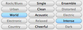
A nagging problem that was still lingering was the appearance of the tags that configure the dialog. I just knew there are current‐generation UI controls that could serve as a model for this. I found them in Apple’s Garageband:
These have the function of checkboxes—used to build up a list of selection criteria—but are more compact and neat, with less visual noise. Taking that as a starting point, it turned out that for us something even more compact, neat, with way less visual noise was required:
Call it a configuration matrix. It can be implemented with a table widget, but forget about just taking the default table widget. An exercise in toning down is needed to ensure that it stays in the background compared to more important elements in the dialog:
Note that the columns in the matrix have a variable width to optimise the space for the tag labels. The shortest sit next to the longest inside a 200‑pixel column. The mid‑sized tags sit together in their own 200‑pixel column.
To show the configuration matrix in action, here are all the combinations of three of the tags (animated gif):
More full‐size dialogs: first, second, third, fourth, fifth, sixth, seventh, last
more solutions
Eleven of the tags in the configuration matrix are reserved to be set up by the printer. The twelfth is reserved for the application name, top‐left in the widest column. This is the place where the application integrates if it has got a few printing parameters of its own.
Remember, if there are more than just a few, then an application is better off showing the whole transformation–to–paper process in its own main window, preferably with hands‑on UI to control it.
the gray zone
In praxis, some combinations of printer settings do not mix and match, so when one is set the other one should not be available. Example: folding and hole punching is not possible. Although better interactive UI should communicate that, the best we can do in praxis is to disable hole punching when folding is on.
To not leave users completely in the dark why a certain parameter cannot be set, I introduce a subtle icon next to it:
Clicking on the icon will bring up a dialog not only explaining why the parameter is disabled, but also what to do to make it active again. Hyperlinks in that dialog could show and highlight the necessary UI for that in the dialog.
blink revisited
Speaking about highlighting, we have combined tag–parameter highlighting (when clicked) to make a connection between a tag and its associated parameters and this is what looks like in this version (animated gif):
summit sumarum
The Montreal openPrinting summit got everybody in the printing community connected again. There is a sense of urgency that this is the chance in the next five years to get printing on linux sorted out.
Folks from both gtk and KDE were there and that gave them a jolt of inspiration to get ready to work on implementing these dialogs. I look forward to working with them.
Labels: design stage, openPrinting, practical
next‑generation printing dialogs /3
23 July 2007, 20:05
Another round of working on the openPrinting dialog. As it turned out, it was an exercise in detailed design solving general issues.
The first issue I wanted to tackle was the (not so pretty) vacant space in the dialog when no tag has been selected. So I took the scissors to the dialog:
The idea I wanted to try out was a fluid layout for the tags and a dialog that would be sized smaller in the ‘no tag selected’ case. I cut the tags section in even smaller pieces and shuffled around until the idea worked. Here is a sketch:
rinse and repeat
Also I wanted to address the perceived complexity of the dialog, the gist of the feedback I had received. For this I had to practice what I preach:
‘the most important aspect is that you are able to throw everything out and start again from scratch’ps, whenever prototypes or mock‑ups are discussed
You have to stay agile as long as possible in a project. Else your hand is forced by existing drawings when trying to solve interaction issues. I ditched the visio files, visio itself, and the windows template. Moved on to omnigraffle, started with a clean canvas.
beyond the frame
I dealt with another issue at this point. Up to now I had been taking the window frame of the dialog into account. On linux the window frame can be any shape, graphic design and color.
To solve that, I literally took the window frame out of the picture. I deducted 30 pixels at the top and 4 for all other sides from the 640×480 maximum size we are working with and set my canvas size accordingly.
narrow down
I started with designing the smaller dialog for when no tags are selected. Before I show how that worked out, first our:
- disclaimer
- this is a quick‐and‐dirty lash‑up to show you what we mean; there are for sure some things missing and lots of small issues to solve; enjoy nonetheless…
It has also been a while that I have reminded us all that the design shown here is for general inkjet only. The other printer clusters will have at least a different set of tags—mapped to a different set of printing parameters—if not more fundamental optimisations of the dialog itself. Remember that one size does not fit all.
Here are some of the solutions I have put in:
- a slightly bolder appearance for the quick presets list, as it has a higher priority than all the tag and parameter stuff;
- sized the quick presets list items like I always intended: 1½ times the height of a normal list item, for a single line of label text; multiple label lines: normal size;
- shrunk the right column in the dialog to the size of the quick presets list (minus the scrollbar);
- flowed the printer + tags section into the right column;
- toned down the tags, which turns out to be quite tricky; it is easy to make them look disabled or not clickable at all;
- the return of the dogcow, to trace back our heritage.
This all sits inside the actual window frame. Before someone trips over the shadow: that is just a bit of ‘special sauce,’ to make it all come alive:
building up
Next, what happens when a tag is selected? The dialog grows so that the right column gets the same width as the middle one. The tags move up—elegantly—to make room for parameters. The gradient under the tags is not decoration: it forms the connection between the tags and the parameter area:

When more tags are selected, the dialog will need to grow vertically at some point to accommodate them. Before that happens, the tags can still move up a bit to make some more room:

Here are all the combinations of three of the tags, in all‑jerky, all‑dithered animated gif glory:
More full‐size dialogs: first, second, third, fourth, fifth
design on a toilet roll
If most users select up to three tags per application and with eleven tags as shown here, how many configurations are possible? Answer: two hundred and twenty.
How does the interaction architect that designs the dialog for a certain printer model stay in control of good UI, without being at the mercy of an algorithm or of the developer? Here is how it works:
- take the complete list of printing parameters, say for general inkjet;
- segment the parameters into logical sections, that make sense to users, as opposed to those that make sense to printer manufacturers;
- design the UI for each section, on a canvas with the width of the right column in the dialog;
- sequence the sections in a logical order, again a decision on a user interaction level; now you have designed a long column of printing UI;
- decide on the tags using usability research and map them to all the printing parameters;
- finished.
max headroom
Reviewing the list above I notice how similar the first four steps are to designing a contemporary printing dialog with tabs. I also notice an additional problem with tabs: you have to make a variable number of controls fit in an area of fixed width and height.
The problem is not having to fit a lot into a fixed area, you can always split it in two. The problem is having to fill out a fixed area with almost nothing. I can distinctly remember evaluating dialogs where desperate measures have been taken to make one or two checkboxes ‘fill’ a tab.
Our sections do not have this problem: at least their height adopts to any number of controls. A section with a single checkbox is perfectly OK.
gluing it all together
The following aspects make the steps above work:
- the interaction architect has absolute control over the contents: what is displayed and in what order; this includes the type of UI control: if a pop‑up list is the best solution, then a pop‑up list will be displayed; this situation is quite similar to content with HTML mark‑up;
- the dialog has absolute control over the presentation, it implements the UI style (KDE, gnome) and the UI theme; this includes all the margins between the items within a section and between sections; this situation is quite similar to a CSS style‐sheet determining the look of a website;
- when in the sequencing two sections need to be adjacent, this does not necessarily mean one above the other; they can also be placed side by side in two columns;
- not everything will fit the width of the right column, for instance when we get to work on the high volume printers, the booklet making section is going to be ‘interesting’ to design; the left column in the dialogs shown here is 128 pixels wide, the other two 200, so widths of 328, 400 and 528 are also available for exceptional interaction.
the parameter section is build up as follows:
- the user‐selected tags determine the parameters that shall be displayed;
- these parameters determine the sections that shall be displayed;
- within these sections only the parameters that shall be displayed are laid out in specified order;
- the sections are distributed—serpentine style—in specified order over the column(s) of the dialog:
wrapping up
‘It was an exercise in detailed design solving general issues,’ as I reported before. My intuition tells me that we can go one step further with simplifying the ‘no tag selected’ dialog, but that will have to wait for printing dialogs, round four.
Labels: design stage, openPrinting, practical
next‑generation printing dialogs /2
8 July 2007, 21:35
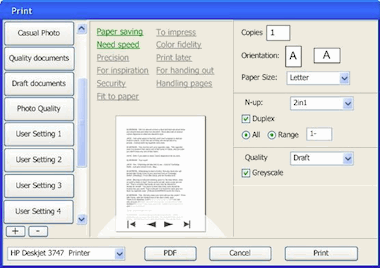
For the openPrinting Meeting on the linux foundation summit in Mountain View, I prepared a presentation. I updated our mock‑ups of the printing dialog for the occasion.
As discussed last time, the usability team had some constructive critique for the first mock‑ups:
- printer selection pop‑up at the bottom? from looking at the task logic it needs to be at the top of the dialog;
- there can be confusion over what a quick preset does (change the printer settings, not any dialog parameter display) and what a tag does (change the parameter display in the dialog, not any printer settings); the dialog could do more to avoid this confusion;
- there needs to be a stronger relationship between the tags and the the parameters shown; a stronger showing of cause and effect.
starting at the top
I started with the first point, printer selection to the top. I noticed that choosing a printer configures the actual dialog: which quick presets are available, and which tags. Also, the tags purely configure the dialog itself.
Combining this led me to take printer selection and tags out of the content of the dialog and make them part of the frame of the dialog. This addresses in part the second point of critique.
Before I show how that works out in practice, first our:
- disclaimer
- this is a quick‐and‐dirty lash‑up to show you what we mean; there are for sure some things missing and lots of small issues to solve; enjoy nonetheless…
Keeping that in mind, here is the dialog in default appearance: no tag selected:
Note that I lightened up the quick presets list on the left, but the items are still nice and big for quick access. Also I wanted the tags to form a cloud with a loose structure. This whole top printer + tags section has much more a ‘written sentences’ feel than ‘controls on a grid.’
I have used color and position here to make the top section part of the dialog frame, to show the principle. However, on linux the dialog frame is set by the window manager, which can give it any shape and color. So later a different solution will be needed for KDE or GNOME and I will work with the developers of the Qt and gtk toolkits on this.
Also there is the ‘written sentences’ aspect, which becomes interesting with internationalisation for right‐to‐left languages. But nothing that can’t be solved.
pretty vacant
Here are some tags in action:

More full‐size dialogs: first, second, third, fourth
The big wide open space at the right of the dialog—when zero or one tag are selected—is not very satisfying. The dialog can be more compact in that case. However, keeping the quick preset list nice and big, and the overall dialog make‑up relatively stable, will require some fluidity in the printer + tags section. To be continued…
blink
To address the third point of critique I introduced animation when a tag is switched on or off, to show the connection between parameters and tags. I could have gone for the matching parameter widgets to fly in and out of the tag. Instead, I settled for a color highlight of the labels of said parameters:
coming up
Jan mühlig of relevantive talked to me about a couple of quick rounds of usability testing. With both of us analysing the test results together and me refining the dialog concept in between every round, that makes a nearly ideal design set‑up.
I am looking forward to that and to report about it in printing dialogs, round three.
Labels: design stage, openPrinting, practical
linuxTag, printingTag
10 June 2007, 19:32
Last week the linuxTag expo and conference was held here in berlin. It was also the site for the openPrinting in‑between UI summit. I had set for this occasion the goals of showing mock‑ups of what we thus far had only been talking about and to start getting the linux UI platforms (KDE, gnome) involved.
from thoughts to paper
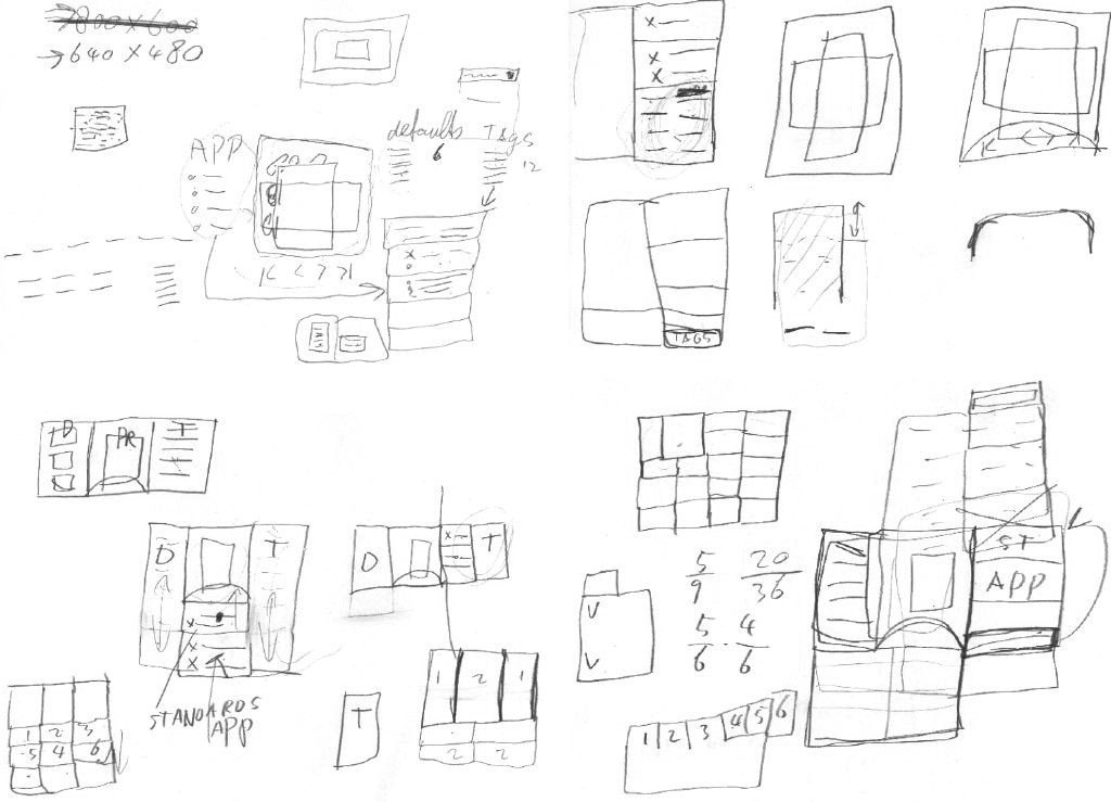
To prepare, I spent a day sketching the printing dialog, together with Andrea Alessandrini—my associate on this project. We had set ourselves the target of ‘fits on a 640×480 screen.’ Dialogs need a modest size, and this way it can still be used on mini‐sub‑notebooks.
In this dialog we have to show the sections that form the core of our solution:
- quick presets
- aka printing defaults; with one click, the printer is set up for what one wants to do: print a high‐quality photo, a document, some internet images; these presets ship with the printer for instant success, and users can make their own; quick presets need to be directly clickable, not in a pop‑up menu, else they are not ‘quick’ enough.
- preview
- a square area (shows portrait + landscape) where one can preview if the print is correctly transformed to paper; shows also staples, punched holes, duplex, watermark; includes controls for flipping through the pages; the preview needs to be big enough to be reliable, but no need to be able to read text on the page either.
- tags
- these stand for the aspects of printing that can interest users; by selecting one or more tags users configure their own dialog; using the tags should be effortless, users should not even notice that they are configuring their dialog.
- printing parameters
- these really control the printing in detail; the number of parameters that need to be displayed varies and depends on the tags selected.
Most of the day saw us probing where to put the tags, and how to cope with this seriously varying number of printing parameters:
from paper to screen
The weekend before the linuxTag was spent making mock‑ups of the dialog for general inkjet printers. Yes, they are in windows look + feel, but that happens to be a neutral position in the great KDE vs. gnome stand‑off. Andrea used visio, which comes with a windows l+f template, so we did not need to reinvent the wheel. But first:
- disclaimer
- this is a quick‐and‐dirty lash‑up to show you what we mean; there are for sure some things missing and lots of small issues to solve; enjoy nonetheless…
Keeping that in mind, here is the dialog in default appearance: no tag selected:

The quick presets are in the left column, with two buttons to add and delete presets. Tags are shown in the centre column, with the preview below them. The preview has a semi‐transparent heads‑up display for page navigation. In the right column are the printing parameters, showing here only the absolutely essential.
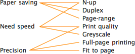
many–to–many
The tags shown are just examples to demonstrate that they do not only cover technical aspects of printing, but also user experience aspects. Here is the relationship between three of the tags (left) and their seven parameters:
Note how each tag is connected to a low number of parameters. And how two of the parameters (N‑up, Print quality) each belong to two tags. The parameter section builds up according to the tags selected:
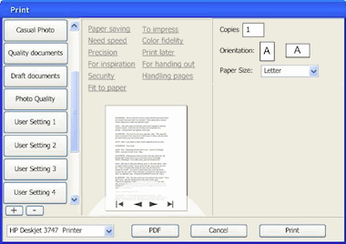
Full size dialogs: 1 tag, 2 tags, 3 tags. Which tags were selected will be persisted on a user + printer + application basis. This means that users optimise the dialog for each application they print from.
When even more tags are selected, The dialog will grow vertically to accommodate the extra printing parameters. The centre and right column have the same width, so parameters can be placed in both.
design decisions
The actual tags, parameters and their mapping come straight ‘from the printer,’ e.g. the driver or the PPD. It is ultimately the interaction designer that works for the printer manufacturer who decides what makes sense for a particular printer model.
Our team will set the standard here by designing tags and mappings for the seven printer clusters that we are working on. Usability surveys and test will be used to fundamentally answer the question ‘what aspects of printing do actually interest users?’
think different
For manufacturers, the tags are an excellent way of differentiating themselves. Not by introducing a tag ‘manufacturer xyz’ and associating some proprietary parameters with it. Instead, by representing unique benefits with a tag:
Say a manufacturer has a line of office printers of which the unique selling point is that these make your meetings 33% shorter (cool). Then introducing the tag ‘Shorter meetings’ and associating the parameters that enable that is the way to go.
expert evaluation
At the linuxTag, the openPrinting interaction architecture and usability team met, together with project organiser Till Kamppeter. The usability and interaction experts present (Celeste Lyn Paul, Jan Mühlig and me) discussed the dialog mock‑ups.
We found the concept in general really promising. It can be a definite improvement over the current printing dialogs of any desktop platform. But:
- printer selection pop‑up at the bottom? from looking at the task logic it needs to be at the top of the dialog;
- there can be confusion over what a quick preset does (change the printer settings, not any dialog parameter display) and what a tag does (change the parameter display in the dialog, not any printer settings); the dialog could do more to avoid this confusion;
- there needs to be a stronger relationship between the tags and the the parameters shown; a stronger showing of cause and effect.
These combined would probably cause this dialog to fail a usability test. The good news is that for us it is straightforward to sit down and solve these points. We are working on it.
automatic for the people
I was anxious to hear what Josef Spillner, our resident guru on auto‐configuring dialogs, had to say about the feasibility of our concept. The fact that parameters can belong to multiple tags makes for tricky grouping of parameters. This is not your fathers’ dialog with tabs:
Full size dialogs: first, second, third
Josef thinks that he and his team can crack this puzzle. We discussed the additional challenges of keeping parameters grouped in a logical way and giving the interaction designer that works for the printer manufacturer the means to override the auto‐configuration in exceptional cases.
all aboard
The first contact with folks from KDE and gnome and their respective UI toolkits, Qt and gtk, was very encouraging. My demo with the mock‑ups created a lot of enthusiasm, and the tag system was perceived uniformly as ‘very cool.’
LinuxTag was the first step on the road to cooperation. In the next weeks more steps will be taken, together with both the gtk community and Trolltech.
Labels: design stage, openPrinting, practical
more printing in siena
1 May 2007, 12:35
After the printing in siena blog entry, a healthy amount of discussion ensued in the printing community. Here are a couple of concerns that I need to address.
‘are you sure this is going to work?’
We are going to user‐test these three new solutions to validate them. If they do not work, we will improve them. If any of them still doesn’t work, we will trash them and go for plan B. This is usability at its best, validating before committing to write code. It is called verified innovation.
‘“just print” without a dialog? cannot work…’
An awful lot of printing today looks like this:
- user invokes Print…;
- dialog is shown;
- user presses Print button straightaway.
My analysis is that the printing dialog in these cases is actually obstructing getting the print done, because the user ‘knew’ that the print was going to be fine anyway, before invoking Print…
We have corroborated this already with user testing. ‘Just print’ has been conceived exactly for this ‘awful lot of’ printing. Nobody is forcing users to forgo the printing dialog, they can and will use Print… in case of doubt about the happy outcome of a print job.
‘but things can go really wrong without a dialog’
This is the reality of today’s printing dialogs: people who just want to print, don’t read them. In these situations they simply do not function as the point of final check and confirmation. You could write in the dialog ‘These print settings will get you fired…’ and without a hitch, the Print button will get pushed.
Thus showing a dialog with printer settings does not prevent in any way ink, paper and energy being wasted on a doomed print. So my priority is to offer those 95% of users 95% of the time the option they need: forget about the dialog.
‘is this like that print toolbar icon in word?’
The developer at microsoft did the following: He took the icon that for years and in thousands of applications has the meaning of Print… (show the dialog) and attached a different function to it (default print without a dialog).
Brilliant.
Attach a different meaning to a ubiquitous symbol. No interaction professional would do that. No wonder users are confused. We will do two things differently:
- two, clearly labelled, different UI paths for the old Print… and the new ‘just print’; two menu items, two key shortcuts, and if you must have toolbar icons, two clearly different ones;
- a smarter behaviour for ‘just print’ than the print‐with‐defaults that word offers today.
‘too smart by half’
I should have put in a couple of examples of the applications smartening up about the transformation. In siena we discussed spreadsheets avoiding to put the last column on a separate piece of paper; web browsers that instead of formatting for 2.03 pages, subtly get it on exactly two.
Or a photo application not printing on the laser printer but on the color inkjet. This all is applying domain knowledge within the application to get it done. And involves no heavy‐handed meddling in the printing parameters.
‘machines take control over humans’
We want the applications and printer drivers to learn from user’s preferences. I want the printing driver to figure out that I tend to print multiple pages 2‑up, and duplex where available.
siena leftovers
no clue
We discussed the error‐case when either the application or the printer driver really cannot figure out how to ‘just print.’ For instance, this can happen when an application is asked to print for the first time, or when a file is printed for the first time.
If this is the case the print dialog will be shown anyway. And from thereon the precedent is set for this situation.
subtle clues
Part of the ‘just print’ solution is that we subtly communicate that the print is preparing–queuing–printing–ready. So that when users want to, they can get confirmation about the status of the job.
For instance by putting an icon in the taskbar that reflects what is going on. When clicked it could show more details, but else it stays outside of the users’ workflow.
application integration
We also agreed that we prefer that applications integrate their UI for the transformation into the print dialog. This ties the transformation parameters to the preview in the dialog.
We realise however that there are applications where the transformation is a big deal, or a complicated job. An example of the former is GIMP where placing the image on paper is part of the artistic workflow, of the latter is placing a spreadsheet over multiple pages.
Then the UI for this has to be displayed before the print dialog. I think Apple is right‑on in this regard with their drive to get this to take place inside the application main window. And to supply users with hands‑on UI to take control of this transformation.
Finally, it would really not hurt if in this ‘on virtual paper’ view, a ‘just print’ button was offered to bypass the print dialog.
the future is bright
As I am writing this, we are sketching print dialogs. We are discussing usability surveys to get the most out of the tags concept. Stay tuned for more news on that.
Labels: GIMP, openPrinting, practical
printing in siena
10 April 2007, 13:18
last week, part of the openPrinting interaction architecture and usability team met in Siena, Italy. I am leading that effort and had arranged this two‐day meeting for reviewing the work done up to now, and to brainstorm solutions for the design phase, in an inspiring atmosphere.
realising the vision
Right on the first morning, I led the discussion into the direction of ‘what if we do not need a print dialog at all?’ And from there we actually arrived at the concept of ‘just print’, which implements the openPrinting project vision:
‘…how to make printing with free software easier and better, so that it “just works”.’Till Kamppeter, openPrinting organiser
Remember that printing does not exist as a task for users? ‘Just print’ will get the job done for them. Choose this new command from the File menu (it needs a better title) and the application and printing system will handle the rest. No dialogs are shown.
get fresh
To enable this, applications and the printing system need to clean up their act:
- the application needs to use its full domain knowledge to get the transformation right: the act of getting the data formatted for paper media. This goes beyond just using the defaults, it means analysing the data and taking some smart choices, taking previous user choices into account. This includes selecting the right available printer and the right paper.
- both need to put some effort into the handover: the act where the application hands the formatted pages to the printing system and both negotiate the application’s wishes. We want to see the both of them working together, instead of autistically against each other, as they currently do.
- apart from listening to the application, the printing system can also have a good look at the actual print data from the application. Number of pages; aspect ratio; bitmapped, screened, line art, or text data; color or black & white? Make some smart choices based on it, again beyond the defaults and based on past user choices. This also safeguards against old skool apps that do not implement the first two points.
This all may look terribly complicated, but forty lines of code per application and printer driver can make a world of difference here. All this smartening up is also a precondition for the advanced dialog stuff as discussed below.
parallel port
From my point of view we have now circumvented the paradox of providing ‘one‐click’ operation and making 40–80 printing parameters available through the same UI. We have simply built ourselves an optimised UI in parallel for 95% of users, 95% of the time: ‘just print.’
dealing with 5,000,000 use‐cases
So after feeling very smug about eliminating the print dialog, we spent the rest of our two days redefining it, for that sliver of users—or occasions—where it is called for. It will be still available via the normal Print… menu item.
Again I led the discussion into the direction of ‘can we get rid of the print dialog as we know it?’ Somehow we tripped over hyperbolic browsing. Although it offered no solution, the graphs used to illustrate this principle did give me the following idea:
What if we let users put together their own personal print dialog?
an uncategorisable mess
The problem with print dialogs today is that 40–80 printing parameters are categorised into six or more ‘tabs’, to cut down the shear mass of them for presentation. Putting them all on one panel would be a horrible mess.
This has a couple of side effects, which were bothering me on an architectural level:
- lost overview
- one has to traverse the tabs to piece together the big picture;
- broken relationships
- printing parameters that are very much related in the mind of the user for a particular print, end up on different tabs, because the categorisation is general, thus rational;
- misplaced children
- just like with files and folders, a printing parameter can only be assigned to one category (tab); I was already dreading an undecided outcome of card sorting tests, telling us that 50% of the users will never easily find a parameter, regardless of on which tab we placed it;
- wasted time
- no matter how brilliantly one categorises the parameters, with six tabs there is a 83% chance that one has to change tab to adjust only one parameter, 56% for changing tabs twice for changing only two parameters and 28% for 3 parameters over 3 tabs. Because all these tab changes are context switches, they are much more costly in time for users than a single click.
So let’s give users a more fine‐grained control over which parameters they can see together in one dialog. For instance by providing twelve instead of six categories, which users switch on or off to build their own dialog. And the printing system remembers these configurations for each application–printer pair.
- no, this will not lead to monster print dialogs with every parameter visible; I am confident that apart from the always‐visible trivial parameters, only one or two extra categories will be made visible for a particular application; it is just that for every user in the world these will be a different combination;
- no, this will not lead to a monster database with thousands of application–printer configurations on the user’s hard disk; I am confident that each user has use for a dozen applications to print on maybe half a dozen printers; it is just that for every user in the world these will be different;
- no, this will not lead to linux geeks being able to put together their own Frankenstein dialog by hacking an xml file; still a lot of interaction architecture is involved with enabling all the combinations to make sense when combined, and that is not going to be left to innocent bystanders.
So I was quite pleased that with this concept we have solved almost all of the problems of tabbed print dialogs. We have given the print dialog the ability to morph to the needs of individual users and thus, be able to handle the five million use‐cases that plague the printing design challenge. But on leaving Siena, I also knew that misplaced children could still occur.
tags, not tabs
The day after returning from Siena, I was at the innovationsforum interaktionsdesign. Bernard Kerr (del.icio.us) was presenting some past work on tag orbitals, when it hit me:
Instead of sorting printing parameters into categories, we could apply tags to each parameter and have users select some tags to build their own dialog.
feeling fuzzy?
Contrary to the rigid nature of belonging that comes with the one–to–many (folder and files, category and printing parameters) relationship, that of the many–to–many (tags and printing parameters) relationship is a bit fuzzy. And that is a good thing, here.
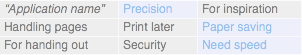
Tags circumvent the misplaced children conundrum. It is very similar to why hierarchical content organisation is going out of fashion on websites, as will folders on hard disks. And beyond that, they literally open up new dimensions for talking about printing parameters. Here are some tags off the top of my head:
- need speed?
- paper saving
- security
- precision
- paper orientation
- hand‐out
- impress yourself
The sky is the limit. We are exploring the possibilities as I write this.
Labels: design stage, internship, openPrinting, practical, product vision
printing, design, students
7 February 2007, 15:38
I just finished the selection procedure for my second openUsability student project. This time, I will be working on openPrinting with an associate. Meanwhile, the pilot GIMP project is still running fine.
I want to thank Ellen Reitmayr for suggesting that openPrinting take part in the openUsability student program, and for organising the whole shebang.
After reading the CVs and interviewing candidates, here are some of my impressions.
printing is not sexy
Significantly less people applied for the printing project than for GIMP or for other popular projects in this round of student projects. My conclusion is that printing does not really tickle the imagination of interaction and usability students.
That is a pity, because the field of printing interaction is actually wide‐open for innovation. Having performed an evaluation of the available desktop platforms, I present here my take on the state of the art in printing interaction:
- windows
- no idea about vista, but printing on xp is stuck in the early nineties. One size fits all; add a tab for bells, and one for whistles when needed. The lack of interaction support for new categories of printing developed since the early nineties is apparent, and one can forget about new patterns in working. ‘We’ve got to do better than that,’ is the consensus among the openPrinting project.
- mac os‐x
- late‐nineties printing interaction, but there is constant innovation going on at Apple. ‘Give us something like that,’ is the consensus among the openPrinting project. But I know Apple is looking further ahead, and why would I copy last year’s model, and sell it as new design to a project?
- gnome
- they copied an old‐timer (windows) for their brand‐new printing interface. No vision equals no inspiration, not worth all the development effort…
- kde
- a raw, technical representation of a config file, missing any interaction concept. Enough said…
So let’s bring printing interaction into the 21st century, and get gnome and kde on board to realise it.
method overload
‘These students know more usability methods than I do!’ was my first impression. But after googling some of the unusual suspects, familiar descriptions appeared. Another case of alphabet soup.
I interviewed three candidates, and all of them were concerned if we were going to use enough of those usability methods. I had to explain them that printing is so general—in a way, so abstract—that Jan Mühlig, Ellen and I have recognised that throwing more usability methods at it simply creates a bigger jungle of facts.
So the preferred approach is architectural. Usability plays an important role in validating and debugging our concepts, and in proving the client projects—openPrinting, gnome, kde—that our innovative concept is a clear improvement.
the design gap
All three candidates I spoke to went to study at design institutes with the dream of making software and the web function better, for users. All three were disappointed to realise that, all the teachers and their fellow students were interested in, was making things prettier.
So these young designers are graduating, not trusting their fellow designers to be even aware of the usability issues they create. They feel their education is incomplete, and have to look for other ways to obtain interaction architecture skills.
They know they have to, to be able to improve the interaction that surrounds us all.
Labels: fundamental, internship, openPrinting, ucd
preparing for lexington /2
18 October 2006, 22:09
After the first installment was published, Jan Mühlig and I worked some more on the openPrinting project.
ceci n’est pas une pipe
I was curious to find out what users expectations are—apart from ‘get it on paper’—when they print. So Jan did some user testing.
And guess what: there is no such thing as printing.
It does not exist as a task, as a meaningful activity. One moment you decide to see it on paper, the next it rolls out of the printer. Only invoking the print command has a place in between that.
print professionals
I can see how this holds true in general, even for people whose job focusses on the printed page as the final result, like print designers. Apart from going through a calibration process, their own printing of proofs has to ‘just work.’
Only people whose job it is to operate (big) printing machines do care about the process and its parameters. The operator and the specialised software to run those machines means they are exactly not within the scope of this project.
implications
All this validates our approach to work with defaults for different printer settings for different tasks. The printer vendors need to supply these, backed up and refined by the community.
The individual user needs to be able to refine and customise the defaults for their own workflow. And selection of a default must be really direct, selecting from a pop‐up menu is not going to be good enough here. It would defeat the purpose of the whole concept.
lead by example
We saw last time that life gets a whole lot simpler if you design the printing dialog for a specific printing model, working from its product vision, which includes market segment and the printing solutions offered.
But we cannot answer the question ‘what does a good printing dialog look like’ with ‘depends on the printer.’ That would leave all printer vendors and desktop projects completely in the dark.
generic medicine
So after some discussion Jan and I came up with the idea of designing a printing dialog for several generic printers, each representing an important market segment, examples of which are:
- a personal laser printer;
- a personal photo printer;
- a workgroup color laser printer;
- a department A0 plotter.
The resulting printing dialog would be generic in the sense that it is based on a generic product vision, offering a generic printing solution. But it would allow us to set the standard any printer‐specific printing dialog will be measured against.
more specific…
Vendors and software projects can then use these generic printing dialogs as a starting point for their own specific dialog. Not by dumping any printing parameter that is printer‐specific on a tab or dialog called ‘Special options’, but by integrating these with the generic parameters into something well‐organised that makes sense to the user.
Labels: openPrinting, practical
preparing for openPrinting, lexington
11 October 2006, 01:06
In less than two weeks there is the openPrinting Summit in Lexington (US). Jan Mühlig of Relevantive and I have been invited to attend and to work on the user interaction and usability aspects of printing, as implemented on all linux platforms.
…where to start?
Apart from starting to discuss with Jan, who has been involved with this project for a while, I also had a hand‐over session with Ellen Reitmayr while enjoying some Sudanese food. Ellen worked with Jan on the project, but has decided to concentrate on KDE.
The project scope is vast: all current and recent production printers available, software at operating system level. Usage is very diverse:
- from personal to enterprise printing
- very much an experience question: is the printer directly connected to my computer, or am I sharing one of a hundred printers in the building with tens of others?
- function
- what is the print for: to read; to proof; to share; to impress; to exhibit.
- printing virtual paper
- is what is printed a virtual paper document (A4 or US‑letter formatted) that just needs to be realised on paper, or is printing a transformation of information. The latter is a different experience, with its own anxieties. Examples are printing web pages, photos or database records.
- new patterns in working
- one day working at the office, the next tele‐commuting at home: the default printer for each situation needs to ‘just work.’ More extreme: companies where nobody has a fixed desk, or even a fixed city where they work. It should just take one click every day to confirm the ‘right’ printer.
strategies
Each printer model is targeted at a relatively small market segment. The printer model aims to deliver a printing solution to this segment through its technology. If you combine these two, market segment + solution, then the unwieldy world of printing, as sketched above, becomes quite compact.
So below you will see a couple of times repeated that primarily the information that configures the solution for a UI design problem has to come from the printer vendor. Through their product definition and development process they are in the best position to provide it.
enter the community
To back up and refine the efforts of the vendors, the user community can play an important role.
- back up, because vendors can get a bit sloppy sometimes when it comes to updating and customising printer drivers;
- refine, because unforeseen usage patterns can develop for a printer, and also the ultimate printing parameters for hi‐spec photo papers on a specific printer can be provided by the paper manufacturer and then refined again by printing gurus.
So linuxprinting.org can play an important role in sharing drivers, best driver choices and defaults. In order for this to work, the giving part of the sharing, the entering of information, data or software to this website needs to be painless, meaning seamless integration into the printing UI.
Now let’s discuss areas that are in need of UI solutions.
problem zones
painless printer management
To start using a printer should be as difficult as ‘plugging it in.’ The plugging gets a bit more complicated in networked corporate situations, but I hear that help in the form of geographical display of working and printer positions is on its way.
This is also the place for solutions for new patterns in working. Sets of printers based on a location concept, and a way to make the printer‐of‐the‐day expire are minimum requirements here.
The rest should be ‘automatic.’ The best driver choice and the driver itself can be fetched from the internet. Yep, the printer vendors need to supply these, backed up and refined by the community.
too many options
People just want to print, not tweak a couple of dozen of printer parameters. So what we need is a small set of default settings, derived from market segment + purpose of the printer. Yep, the printer vendors need to supply these. Users can tweak their own defaults, and share these with the world, via the community.
The UI design of the printing dialog, with dozens of printing parameters, which in part are fully depending on the printer in question, need a general solution flexible enough to customise the dialog for the printer. The grouping of parameters and the actual controls used for these need (again) to be provided by the vendors, backed up and refined by the community.
It should be clear that whoever customises a printing dialog for a printer, needs the help of usability folks, to break away from the technical and to focus on user value.
broken printer?
I am told that at the moment printers under linux are technically not able to report back to the user why they refuse to print. This is an untenable situation.
The amount of anger these situations generate are contributing to global warming. Reporting in non‑technical language about the state of a printer is mandatory.
saving some trees
Oh yeah, I would like to save some trees while I am at it, simply by making duplex (where available) and two‐on‐a‐page printing options easier to use. People benefit too. It is much easier to ram a staple through 15 sheets of office paper, than through 60 of them.
Labels: openPrinting, practical
If you like to ask Peter one burning question and talk about it for ten minutes, then check out his available officehours.
 Peter Sikking is an
experienced
Peter Sikking is an
experienced
interaction architect. He unabashedly puts
shipping great products at the centre of his design practice. He is known for
his work for Google, Nokia, the
Metapolator &
GIMP
open source projects,
and startups.
What is Peter up to? See his /now page.
- info@mmiworks.net
- +49 (0)30 345 06 197
- imprint
