teaching interaction /13
8 June 2013, 14:13
At the end of March I was at the FH Vorarlberg, Austria to teach my course, interaction design for the real world.
In a very natural manner, the value and traits of GIMP, as described in the briefing, became central to all evaluation and design work done during the course. Though not 100% premeditated, this is a very welcome development and I will certainly expand on it next year.
I also had the pleasure of introducing another interaction design taboo phrase. In the past two years they were ‘intuitive’ and ‘the user.’ This year it was ‘we tried,’ I have seen it used often enough by my students in reports. Interaction designers do not try, they make. Yes, not everything works exactly as expected, that is what iteration is for. But in general interaction designers are in a unique position for making, it work.
I just can’t get enough
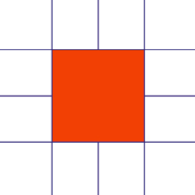
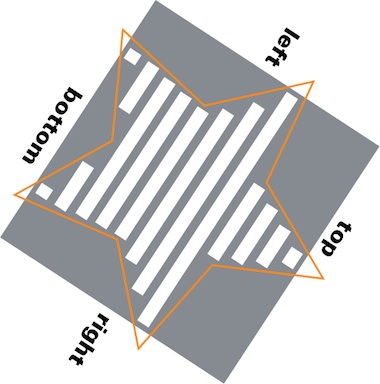
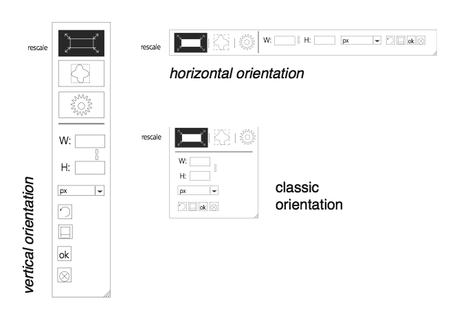
The GIMP design challenge I picked this year was the align tool. It can be used to align—left, middle, right, top, centre, bottom—image layers with various image objects (layer, path, image, selection, channel). This relatively compact tool needs an interaction redesign, it has never received any design love.
While preparing the course, I checked out the tool. Within ten minutes I was asking myself why only layers can be aligned—i.e. moved—and not all the other objects (paths, channels, etc). Also the whole distribute mode does not actually distribute (objects evenly between themselves), it just aligns them with some extra offset. It became clear that the align tool is woefully underpowered: it has not enough functionality.
How quaint. Normally interaction designers have to fight too much and gratuitous functionality, and make it manageable. Conversely, during this course the student design teams had to concern themselves with what functionality to add, to make the align tool fit for use.
scenarios + variants
To flesh out the essential use of the align tool, we made a few user scenarios:
- just align
- this is as simple as it gets: align top/left/etc. of one object (layer, path, selection, channel) with another (all of the above, plus image).
- keeping things together
- pick multiple objects that belong together, e.g. a layer with a corresponding mask, and align as one unit with another object; the same for multiple of these units.
- true distribution
- distribute objects evenly among themselves, or in an absolute way with a fixed offset.
- all together now
- this is as complicated as it can get: combined alignment and distribution of combined units and single objects.
The students used these scenarios for their evaluation of the interaction of the existing tool. With the gained insight into the good and the bad, the students were then ready to brainstorm better solutions. Apart from ideas for fleshing out the functionality, I asked the students to brainstorm two variants of the tool: one as it is now—a toolbox tool—the other anything but a toolbox tool (i.e. using only the menu bar and dockable dialogs).
hands‑off
This was in response to the fact that the current align tool is not much of a toolbox tool. It does not let users change things hands‑on on the canvas (e.g. like paint tools do). On a higher level, it simply does not feel like a toolbox tool. The question then simply becomes: should the align tool be in the toolbox at all? This is what I let the students explore.
This exploration set the student teams up for their reasoned decision on which approach to take—toolbox tool or not—when they moved to the solution design phase. By exploring diametrical opposites they did not only got to know the potential of either solution, they also learned more about either solution, from studying the opposite.
As you will see in a moment, all four teams chose to design the align tool for the toolbox, with some teams adding non‑toolbox interaction to the mix.
four team results
And now the design results of the student teams. The work of all four teams is available under the GNU Free Documentation License 1.2. I will present them in team order.
team one
- members: Allison Cook, Dominic Berchtold + Eva‑Yola Hajdu
- design concept document (pdf, 1.2 MB)
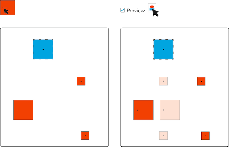
Team one gets straight to the point where it comes to making the align tool a hands‑on tool. Layers can be grabbed and moved around and magnetic points will perform the alignment:
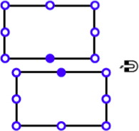
This is a good realisation of the ‘just align’ spirit of the first user scenario. For more complex situations, involving more layers, the team requisitioned the layers dialog, which changes appearance to reflect that (right):
On the left, in the tool options, users can see the list of layers which have been selected for manipulation and unselect them there without having to dig around either on the canvas or the layers dialog.
team two
- members: Dylan Burns, Paula Hidalgo + Nora Huber
- design concept document (pdf, 2.3 MB)
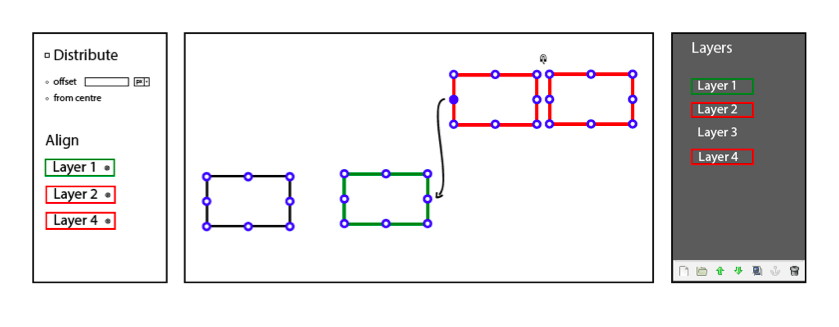
Team two put their minds towards providing quite a few ways to align and distribute (or disperse, as they called it). There is the objects mode, which further develops the existing align tool:
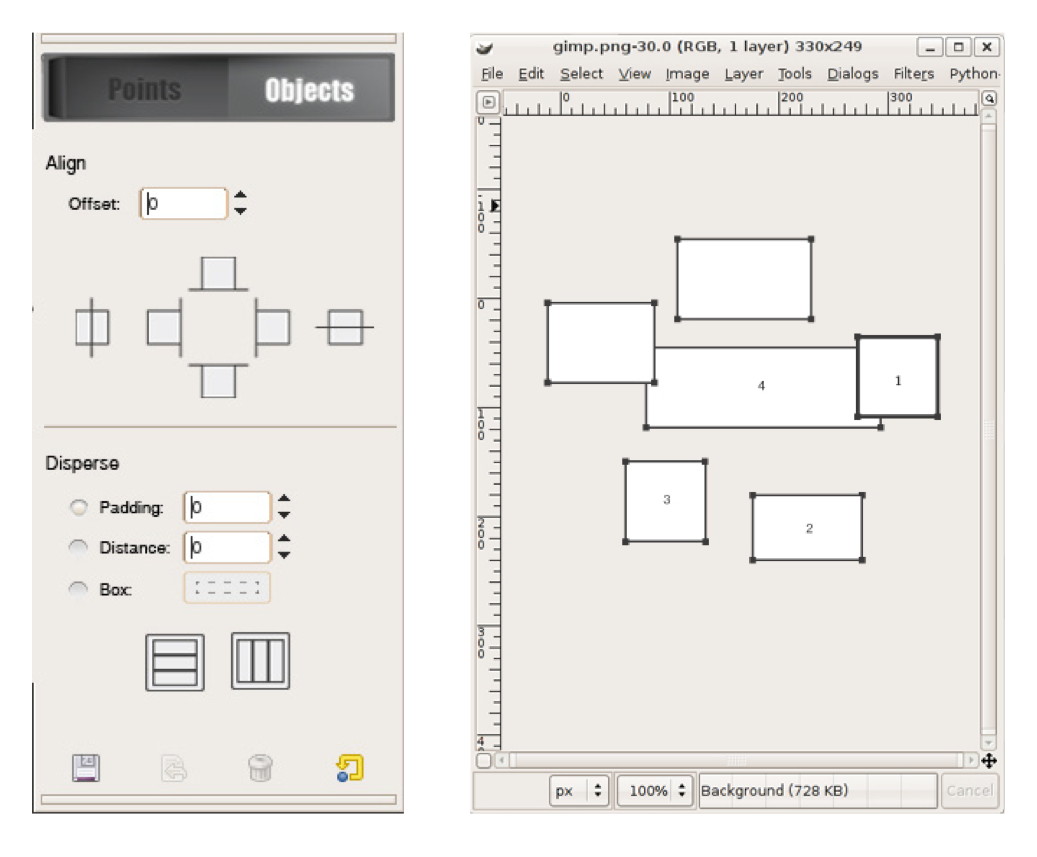
And then there is the points mode, which lets users set a point, a marker on each object that needs to be aligned with a reference point (the star):

This takes into account that in pixel‐based applications like GIMP, the ‘edge’ or ‘centre point’ of subject matter is not necessarily that of the layer, path or mask. Apart from the two modes, also magnetic snapping—similar to team one—is part of the design.
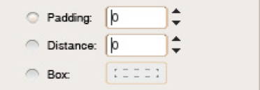
Nice and compact is their design of three different ways to distribute objects in the tool options. The Box mode lets users define a rectangle on the canvas to set up distribution.
team three
- members: Florian Rehlendt, Linda Latzelsberger, Madeleine Mouton + Lizzie Hinojosa Allen
- design concept document (pdf, 508 KB)
Team three expanded align in three new directions:
The outcome of these three are shown below. Align‐along‐path (middle) makes very good use of the path concept:

Team three allows the centre point simply to be moved. As stated above, it is not necessarily located in the centre of a layer or mask (left):
On the right we see the preview option demonstrated, invoked by hovering over an align or distribution button.
team four
- members: Sabina Loacker, Barbara Nader, Nicole Paulo + Thomas Windisch
- design concept document (pdf, 2.4 MB)
Team four designed a different version of working hands‑on on the canvas. Their reference object shows an ‘alignment map’; clicking one of these six lines aligns other highlighted objects with it:
They extended this to the edges of image canvas; click them to align objects with them:
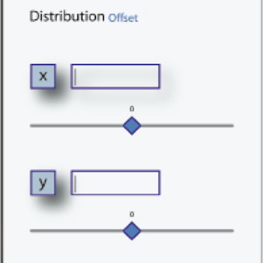
Good to see that team four allowed for different horizontal and vertical offsets and clearly shows these can be negative:
postscript
What started as fleshing out an unassuming tool turned into serious design work when user needs entered the picture. At the end of the final design day, one of the students said ‘there are just so many things in my head!’ Yes, that is what designing is about: connecting many, many things.
Again I had a great week at the FH in Dornbirn this year. I would like to thank all the students for the hard work they put in and for the energy they returned.

rethinking text handling in GIMP /3
6 July 2012, 18:14
Having received back the baton from Kate, I will write up the final part of our LGM lecture. It consists of three more building blocks for text handling in GIMP. But before we dive in, I would like to recount an experience related to the vector building block that Kate outlined last time.
. Dominique, Kate and I were discussing in a design meeting and all of a sudden it became clear that vectors, text and text boxes are not different things in GIMP, but are part of the same continuum. It feels good when something like that happens and
Now, on with the building blocks.
3. warping
Where it comes to warping lines of text to a path, we found during the evaluation phase that across all of the applications, the current situation leaves a lot to be desired. Bits and pieces of it are available in different applications, but what is missing is a systematic approach. Hence we were forced to think of one.
Imagine this to be a block of text:

It is pure text, there is no box around it; linefeeds have shaped the text in this convenient shape. Note that these examples are all shown with left–to–right text, I will get to the internationalisation part in a moment.
We will be warping with this path:
I thought I’d pick a non‐trivial one, intersecting itself and with some sharp bends. Now let’s warp that text, along the lines:
The path is not consumed by doing this, it is applied to the text. Remember that text is a real entity—you can see it in the final, exported image—and a path is nothing but a mathematical definition.
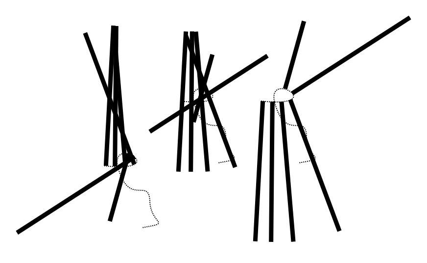
Now you may be asking: ‘what line is actually being warped here?’ Good question. We think it could be any of these five:

Each of these is typographically meaningful and gives different results, so we are going to let users pick any one. Also by having defined which line is used exactly, it is settled where tracking and kerning should be measured for text warped in this fashion.
So that is warping along the lines, what about warping across the lines; what candidates can we find for that? Well, there are these lines used for aligning text:
Here we go, warping that same block of text using the left, centre and right alignment lines:
Up to now we have been looking at pure text, but what happens if it is boxed in? Let’s apply a shape (shown in orange on the left) and see the result (right):
Yes, a box is nothing but a line wrapper. I did notice while preparing this example that it takes a certain offset between the shape and the warped text to make this all work.
exponential growth
Now things are getting interesting. We have defined two orthogonal types of warping and of course these can be combined, using a different path for each.
Also, we see that lines used for either type of warping are related to paragraph‐level typography: leading and text alignment. This means we can apply different warping(s) for each paragraph in a piece of text. Interaction for applying type specs per paragraph is very well established, thus there is no price—UI bloat—to pay for such flexibility.
Here is where internationalisation enters the picture. Changing the writing direction—left–to–right, right–to–left, top–to–bottom, and why not have a complete set: bottom–to–top—has a massive impact on the outcome of warping. Adding this to the mix quadruples the possibilities.
That is the part that is very satisfying: through the power of combinations, by adding a simple system, with no massive UI, we get the possibility of two orthogonal warps, five types along the lines and three types across, per paragraph, times four writing directions.
Looking back, we were triggered by the evaluation to get to the bottom of this topic. And instead of copying the status quo, we ended up with a very elegant model for text warping.
do what you like
What the evaluation also showed was that today, the usability of text warping is really not optimal. It usually works like a one‐way street: you have to start with component A, add B and then you have warped text, with no going back. Does it really has to be that way?
Instead we say: start anywhere. Combine an existing text and path to start warping; start setting type to an existing path; or directly warp the text lines, with the path tool.
4. tools
And with that we have started talking about tools. We have seen up to now that text in GIMP means combinations of different aspects. And that is how it pans out for the tools too:

From left,
- naturally, all text editing and typography work is done with the text tool; we have the possibility here to overload the general keyboard shortcuts and use them to speed up typography work;
- frequently during our design sessions we said ‘ah, but that is a general vector problem,’ meaning handling it falls to the vector tool; all work with the text box lives here;
- the path tool is used for warping, enough said;
- the upcoming combined geometry tool moves pure text blocks and also sizes, rotates, shears and distorts text boxes.
This is a very clear model. It is easy to design for interaction architects, easy to implement for developers and easy to ‘get’ for users. There is however one slight flaw with this plan: it is infuriatingly rigid.
During the evaluation of all the applications we saw plenty of tool switch‑o‐rama, while performing tasks that users perceive as atomic. And that is a nasty discrepancy. Remember one of the points of the vision for text in GIMP?
- ‘GIMP users get: minute control over typography and the layout of text on the canvas.’
That is actually one single task, not two related ones. From this we understand that some cross‐pollination must take place between above tools. Straightforward examples are being able to move a block of pure text within the text tool, and moving and sizing text boxes and vectors (same thing, right?) in both text and vector tools.
easy does it
It is essential to limit the amount of cross‐pollination, or else we end up with four bloated tools with mesmerising functionality. In short: we have to avoid landing in user‐request hell. Handling this is pure design work: building an understanding of the whole activity of handling text in GIMP and identifying the atomic tasks. This then drives the cross‐pollination decisions.
Surprises happen. For this occasion I prepared the (I thought) crazy example of users insisting that path editing and kerning belong to the same atomic task. Crazy, until I realised they are right. When adjusting the warpage of text with the path tool, the complementary parameters that control where the glyphs end up exactly are… tracking and kerning.
Do not expect tracking and kerning to become part of the path tool. However, we will have to deliver a design where users feel they can warp and control how far glyphs are apart, in one flow.
Finally, I did come up with a bonafide crazy example: path editing and colouring text glyph. I am confident that is not a single task.
5. editing
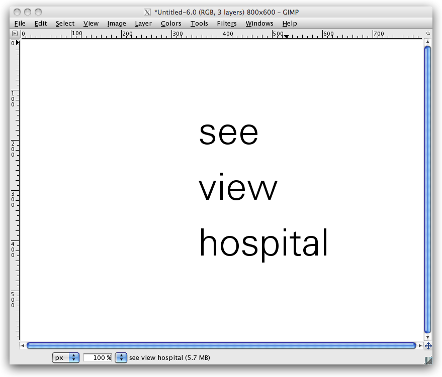
For our final building block, we are gonna go back to basics: text editing. Let’s start with some text on the canvas:
But wait, the vision for text says: ‘Text in GIMP is always part of the composition.’ OK here we are:

I picked a photo here, but it could have been a collage, or some other graphical composition.
The most natural way to edit this text and work on its typography is hands‑on in context (the orange lines are an indication of this; in no way is this a complete interaction design, OK?):
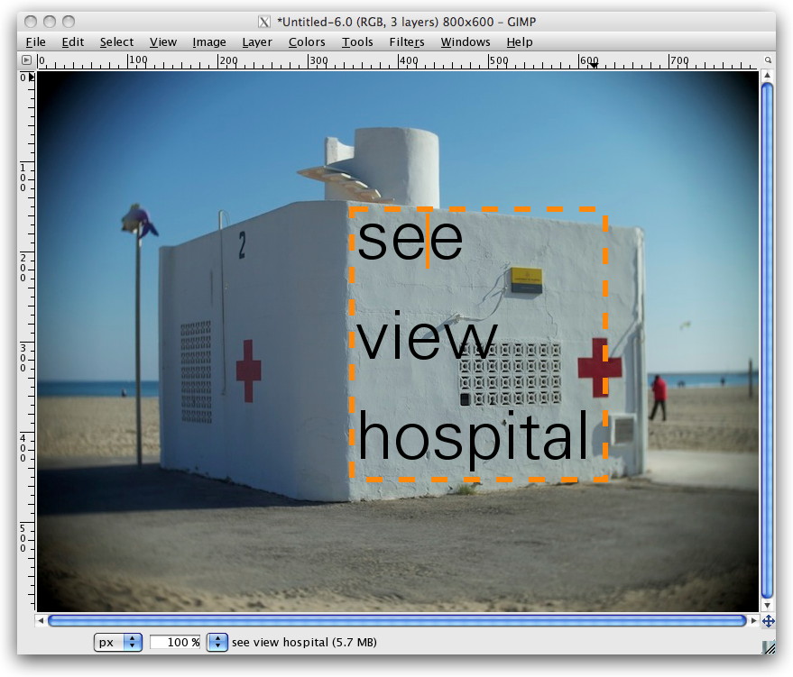
This should be the default in GIMP for working with text.
But there is more: GIMP is an image manipulation program. Text and vector are never the end goal in GIMP, they are the beginning, to receive graphical treatments:
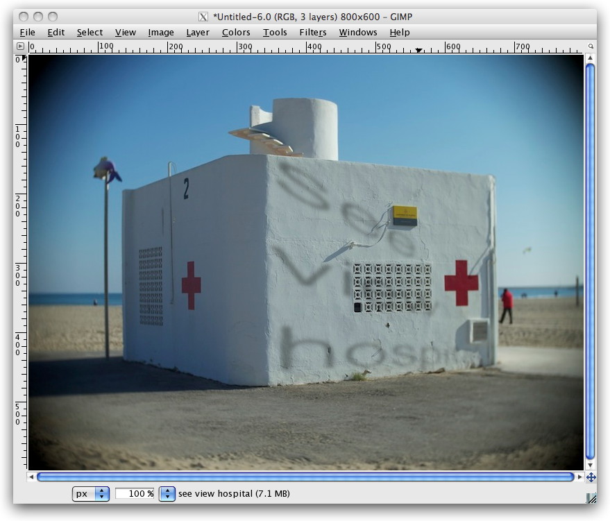
A bit hard to read, no? Not funny having to place a cursor in that, right? That is exactly my point. In a GEGL future, with fully non‑destructive editing, GIMP users will be able to correct that typo, and give that kerning some love, and immediately see the results with all graphical treatments on top.
This means there is a point where optionally—I repeat: optionally—users may want to make use of a clean sheet type of editor (again, this is just an indication; in no way is this a complete interaction design):

As Kate always reminds us: the clean sheet editor has to be out of the way of the same text on the canvas, because one has to see the result, in context.
And with that we have seen how the design of the simplest things is heavily influenced by the context. No amount of interface guidelines could have answered this question. It is simply work for interaction designers who are on the project.
postscript
This story started with a vision for text handling in GIMP. All we did in three blog posts was showing that a design process means vision realisation. Some of you may still ask: ‘where is the UI design?’ And I say: a big, fundamental chunk has now been presented here.
Before this project started, the UI team could only act like a fire brigade towards text handling in GIMP: react to calamities. That is now a thing of the past. This project with Dominique has put everything in a proper relationship. Which means we are on top of the situation now. What lies ahead of us is further refining these relationships and designing text handling in GIMP.
Labels: design stage, GIMP, lecture, practical
rethinking text handling in GIMP /2
21 June 2012, 13:51
A guest blog post, by Kate Price:
Taking over from Peter, I am going to describe the following stages in our process. It’s important to note how we use the steps one by one to undertake the next part of our design process. It really is an accumulation of knowledge and insight.
Then I will start to take us through the first building blocks of the solution that has grown out of our design process.
functionality
This is essentially a list of everything that text in GIMP can do. Because we have a vision, we know what these functions should be. Users have to be able to meet those goals. Functionality is completely independent of the UI and tools. Therefore we have categorised the text functionality as follows: annotation, textboxes, rulers, typography (character, line, paragraph), opentype.
It would be far too long‐winded to go through all the individual functions here… If you’re interested you can review them yourselves.
scenarios
Scenarios for us are narratives which express how a particular type of user may experience using the product we are designing. To help us make them we have the vision and we know what functions the text‐handling needs to include. We could then look at the scenarios made for the programme as a whole, and ask the question—how would these users incorporate text into their working practice with GIMP?
We came up with:
- Photographer
- The photographer wants to add information and text to his image. He needs to control how, when and by whom this information is seen. Thus the photographer scenario is all about workflow.
- Creating text as original art: text as graphics
- Users who make original art using text need to be able to be experimental and creative. The text may go through many stages of transformation. they will need a very high level of control.
- Creating text as original art: text as information
- This scenario was very much in our mind after our discussions on IRC about how people user GIMP. Again and again they said, ‘we use GIMP for making posters—because we have made the original art in GIMP.’ So here users need to be able to have total typographical and layouting control—all in the context of their original image.
- Icon design
- This is all about design and manipulation on the glyph level.
- Web images
- It is in the GIMP vision that the application is for web production. So this scenario reminds us that we must integrate automation, when possible and text handling should include optimisation for export to web formats.
evaluation
Evaluation is always our next step. We evaluate the current situation in GIMP, as well as any designs that are existing. We also look at the applications around us—Photoshop, Inkscape and Scribus, for example, and we ask ourselves what can we learn? But what can we learn in the context of what we know from making the vision, functionality and scenarios. We have the means in place to evaluate according to our users’ needs and our design needs.
analysis
We now have a whole lot of gathered information, and we need to take stock and start sorting this out. We are trying to find a way to turn all of our learned knowledge and our insights into a model which will form the basis of our approach. That will enable us to create a functional, meaningful, useable UI that meets the needs of our users. The needs that we have expressed in our scenarios, and laid out in the vision.
Here is an example of how we work, this is one of the first ‘analysis’ scribbles that Dominic and I made together:
You can see we have already started sorting and breaking down our discoveries into broad areas. These are: creation/editing, typography/text/layouting and text area definition.
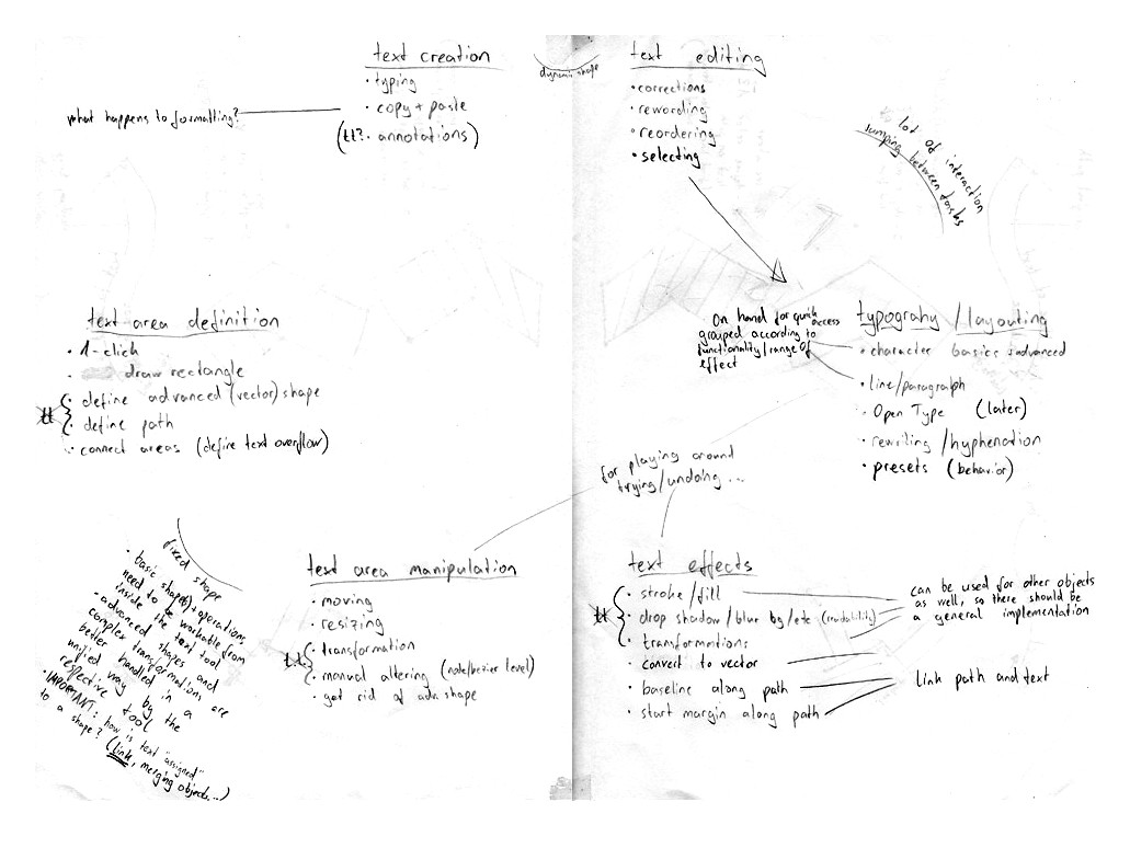
Breaking it down this way meant we could come up with our first model:
- text (and the creation of);
- simple placement—i.e. layouting using text boxes;
- complicated manipulation—applying the whole gamut of treatments, effects and transformations available in GIMP.
These three main areas cover the whole gamut of text interactions that users can make. However, it quickly became apparent that this model would not suffice, as it is essentially hierarchical. It assumes a build‑up of complexity.
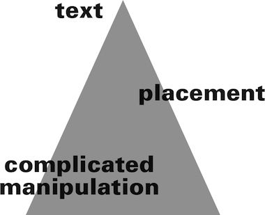
So we moved on to another model:
- we create text;
- we place text;
- we manipulate the text.
This model is cyclical, non hierarchical. Users can move around the circle, they can go back. Because one thing we have learnt about how people need to use text in GIMP, is that they need to be able to go back, to start again, to change—in other words to freely create.
And so, we were at the point when we could use this model to clearly see what the five building blocks of text handling in GIMP should be.
1. text
So here’s no surprise, the first building block of text handling is, yes, text itself. What is paramount to our model is that we perceive text alone, as it’s own entity.
Let’s consider—a user clicks on the canvas and starts typing and creates text. The text runs and runs, until a page break, or a paragraph break is inserted. This is the only way to shape pure text.
So what exactly is meant by text? Well, at it’s simplest text consists of the glyphs and all the parameters associated with typography, and that includes margins.

It must also include the coordinates of where that text is placed on the canvas—in this case we are writing left–to–right so the starting point is the top‐left corner of the text—where the margin starts.
This is the text entity—text in it’s purest form.
2. vectors
This text of course, can be better laid out if it is contained, and this is done using vectors.
- In it’s simplest rectilinear form this is the text box.
- The vector shape contains the text and wraps the text to it’s shape.
- It is essentially a marriage of vector and text, but not an amalgamation.
Of course vectors can be as complicated a shape as our users want to make them. Let’s consider a slightly more complicated example:
The text has wrapped to the shape but it retains a nominal ‘box’ which denotes it’s orientation. This is the text’s own delineation. If we make a transformation—say rotate the text within the vector we can immediately see the power of this—the text retains it’s orientation—how it runs—as well as all it’s other parameters, like the margins.
We can see that the marriage of these two—not the assimilation—allows for a flexible workflow. We cannot predict or dictate when and how this marriage comes about. Users may create text and then want to lay it out—and put it in a ‘box.’ Or they may have a vector that they want to put text in. They may have text and a vector which they want to join. We can only enable this, give them the chance to always go back, and the freedom to create.
It also means that we can see which functions should be within the text tool, and which ones not. Everything which is to do with pure text should of course be in the text tool. Everything which is to do with creation of simple ‘text boxes’ and layouting should be too.
But vectors have a world of manipulation possibilities all by themselves, which we want to harness. So things are going to get a lot more complicated yet—which is where Peter is going to take up the story in the next blog post…
—Kate
Labels: design stage, GIMP, lecture, practical, product phase
rethinking text handling in GIMP /1
20 May 2012, 23:02
At the beginning of this month, most of the open source graphics applications community convened for the libre graphics meeting in Vienna, Austria. After a one‐year hiatus, the GIMP team was back in force, and so were two of its UI team members, my colleague Kate Price and yours truly. We delivered a lecture about our most recent GIMP project, which we will write up in three parts. Here is the first.
beyond the text tool
This project was the first one in our series of open internships. I had created these last year, combining mentoring, open working and getting serious interaction design work done for the GIMP project.
Dominique Schmidt worked with us on this project, which goal is to rethink everything associated with text handling in GIMP. It would have been cool to have Dominique on stage in Vienna, telling the story himself. But he had this holiday booked; to a tropical destination; and surprisingly he insisted on going. Since projects means teamwork at m+mi works, Kate and I were instead fully able to report from the trenches.
The text project is quite a wide‐ranging one and at the moment of writing it is in‑progress. So there are going to be no magic bullets, or detailed interaction design specs to be presented—yet. Certainly a wide‐ranging project demands a structured approach, else it goes nowhere. It is exactly this structure that we will use to present it here, in this and the follow‑up blogposts.
direction
Step one: compiling a vision for the project. With text—and editing, styling it—being so ubiquitous in computers, it is very easy to get stuck in nuts‑and‐bolts discussions about it. The trick is to concentrate on the big issue: what is the meaning of text in GIMP work? What we needed was a vision: ‘what is it; who is it for and where is the value?’
The vision is compiled out of quite a few elements: of course it has to align with the overall product vision of GIMP; we interviewed the GIMP developers who have worked on text; it includes the GEGL future of non‑linear working; and we held an informal user survey on the developer mailing list—plenty of users there—about the essence of working with text.
building blocks
To show how the resulting vision, worked out, let’s discuss it line‑by‑line:
- ‘Text in GIMP is always part of the composition—unless it is an annotation.’
This puts text thoroughly in its proper place; it is never the end‑goal, by itself. Also defined is a separate annotation workflow: users adding notes for themselves or for collaboration purposes. This sets us up for a small side project: annotations in GIMP.
- ‘The canvas is not a page; there is no such thing as paging in GIMP.’
I love this one. The first part was phrased by Dominique, the second by Kate. This puts clear limits on what text functionality GIMP needs: beyond paragraphs, but short of page‐related stuff. Note that ‘paging’ is a verb, it is about working with pages and managing pages.
- ‘Text is both for reading and used as graphical shapes; meta data in text—mark‑up, semantics—are not supported.’
This puts on equal footing that text is for information transport and just shapes; an excellent example where the GIMP context makes a big difference. The second part excludes any meta data based processing: e.g. auto‐layouting or auto‐image manipulation.
And now, we get to the value section:
- ‘GIMP users get: minute control over typography and the layout of text on the canvas.’
If there is one thing we learned from surveying users, it is the essence of typography: to control exactly, down to the (sub)pixel, the placement of every text glyph. This control is exerted via the typographical parameters: margins, leading, tracking, kerning, etc. GIMP needs to support the full spectrum of these and support top‑notch typographical workflows.
- ‘GIMP users get: internationalisation of text handling, for all locales supported by unicode.’
This thoroughly expands our horizon, we have to look at use of text word‐wide: many different writing systems, different writing directions. But it also sets clear limits: if it cannot be represented in unicode, it is not in scope.
- ‘GIMP users get: text remains editable forever.’
This anchors the GEGL dream in the project: no matter how many heavy graphical treatments have been applied on top of a piece of text, one can always change it and see the treated result immediately. But also included here is a deep understanding of projects and workflows. E.g. Murphy’s law: a mistake in the text is always found at the last moment. Or the fact that clients always keep changing the text, even after the delivery date.
- ‘GIMP users get: super‐fast workflow, when they are experienced.’
This reflects that GIMP is for graphics production work and the speed‑of‐use requirements that accompany that.
it’s a wrap
And there we have it. Here they are again, together as the vision statement:
- Text in GIMP is always part of the composition—unless it is an annotation;
- the canvas is not a page; there is no such thing as paging in GIMP;
- text is both for reading and used as graphical shapes; meta data in text—mark‑up, semantics—are not supported.
GIMP users get:
- minute control over typography and the layout of text on the canvas;
- internationalisation of text handling, for all locales supported by unicode;
- text remains editable forever;
- super‐fast workflow, when they are experienced.
Nice and compact, so that it can be used as a tool. But these seven simple sentences pack a punch. Just formulating them has knocked this project into shape. The goals are clear from hereon.
And on that note, I hand over to Kate, who will continue our overview of the steps we took, in part two.
Labels: GIMP, internship, lecture, mentoring, product phase, product vision
teaching interaction /12
12 May 2012, 15:17
A few weeks ago I was again teaching my course, interaction design for the real world, at the FH Vorarlberg, Austria. As always, the course evolved further: a feedback session for draft documentation was built in this year, which proved to be very valuable.
Also I made headway with stamping out non‑designer vocabulary. Last year the taboo word was ‘intuitive,’ this year it was the phrase ‘the user.’ Interaction designers speak of ‘users’ in plural, to get the message across that there are many of them and that they are a diverse group.
working the seam
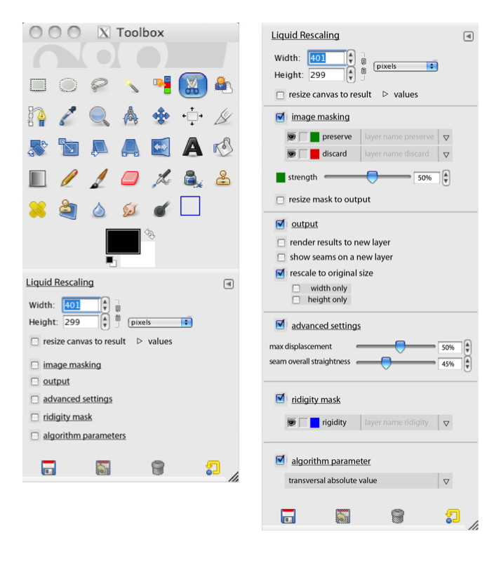
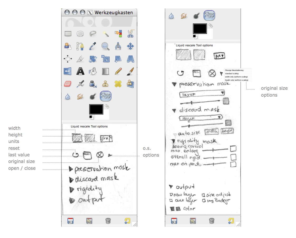
The real‐world design challenge that the students worked on was, like every year, from the GIMP project. This year I picked the Liquid Rescale plugin. It implements seam carving, which means that it finds the uninteresting portions of an image, and modifies only these to grow/shrink an image.
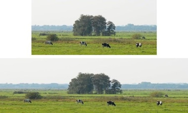 an example from
meetthegimp.org,
mind the cows…
an example from
meetthegimp.org,
mind the cows…
But things are not that easy. There is plenty of parameters to drive this and just about all of them are necessary:

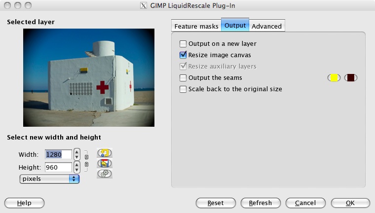

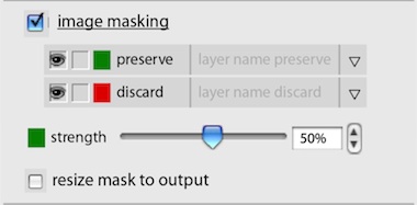
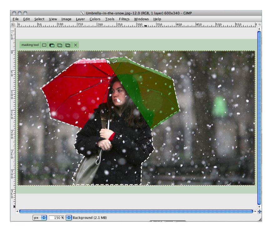
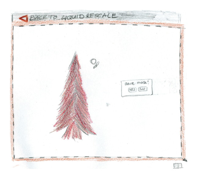
The most important of all these parameters are the preservation and discard masks, which let users specify which parts of the image (or more precise: the layer) are interesting and uninteresting, respectively.
scenarios + variants
To flesh out the essential use of Liquid Rescale, we made a few user scenarios:
- simple resizing, also in relation to a composition (say, a collage);
- precise control while resizing, using the preservation and discard masks;
- make objects disappear without a trace, using the discard mask;
- creative abuse, beyond the hi‑fidelity intentions of the tool.
The students used these scenarios for their evaluation of the interaction of the existing tool. With their insight into the good and the bad, the students were ready to brainstorm better solutions. This year the students were asked to do this in four directions.
This was in reply to two open questions. The first one was ‘should Liquid Rescale be a plugin in a dialog or a toolbox tool?’ The second one had to do with layer abuse: those preservation and discard masks have to be in the layer stack. So I asked the student to brainstorm the direction of using layers and the opposite: not use layers.
After the brainstorming the student teams picked their own course, while designing their solution.
three team results
And now the design results of the student teams. First let me make clear that the work of all three teams is available under the GNU Free Documentation License 1.2. I present them in team order.
team one
- members: Ana Beatriz Bravo Rojas + Elena Zabrodina
- design concept document (pdf, 5.4 MB)
Team one decided on keeping Liquid Rescale a plugin in a dialog. But they worked real hard on reducing the area occupied by the parameter controls, thus optimising the area available for previewing the layer that is being worked on:
I like that they designed these compact controls as a flexible system (quite a challenge), which can be used in different aspect ratios:
Team one settled for using layers to represent the preservation and discard masks and also designed the output of the tool to automatically appear as new layers.
team two
- members: Isabel Schmidt + Simon Wenglein
- design concept document (pdf, 4.6 MB)
Team two did the opposite of team one. They redesigned Liquid Rescale into a toolbox tool, which means it works fully interactive on the canvas. Since there are ample options they designed collapsing sections for them. Below left we see all sections collapsed; on the right all of them expanded:
Also they designed the preservation and discard masks out of the layer stack. They live inside the tool instead, where they can be created, worked on and managed:
Below you can see how team two designed a mask editing session. I like that they did not take the ‘making masks equals painting’ metaphor for granted. Instead they adapted the free/poly selection tool for mask definition needs:
team three
- members: Alexandra Genewein, Katrin Seidel + Nicolai Pritzl
- design concept document (pdf, 2 MB)
Team three also redesigned Liquid Rescale into a toolbox tool. Also with collapsing sections in the tool options. Below we see their take on the collapsed (left) and expanded (right) layout:
Team three gave their own twist to the preservation and discard masks. Treading the middle way, they made it optional whether these would be stored as layers. Below we see the mask edit session, using the established ‘making masks equals painting’ metaphor:
Thumbs up to team three for documenting their design with their pencil drawings. Working in pencil is the norm during my class and as long as it is clear, it is also fine for design documentation.
postscript
Again I had a great week at the FH in Dornbirn this year. The evolving course set‑up, and the fact that every year the design challenges stress different aspects of interaction design craftsmanship, keep things fresh and exciting. I would like to thank all the students for the hard work they put in and for the energy they returned.
GIMP redux, full GEGL ahead
22 January 2012, 17:36
Recently I have been receiving requests to clarify the GIMP UI strategy surrounding GEGL, so I thought I’d write a catch‑up blog post about my 2010 LGM lecture. There I tackled this GIMP UI challenge: a first outline for a UI for a fully GEGLed GIMP. The thinking about this UI, and the discussions with Øyvind Kolås (the GEGL‐meister himself), have been going on for years. Its introduction will be the most profound change to GIMP in the foreseeable future.
two minutes of fame
I started off my lecture with introducing GEGL, the graph‐based image processing engine that is slowly, but surely, being integrated into GIMP. I could spend quite some time taking us through the complete GEGL graph (linked) below:
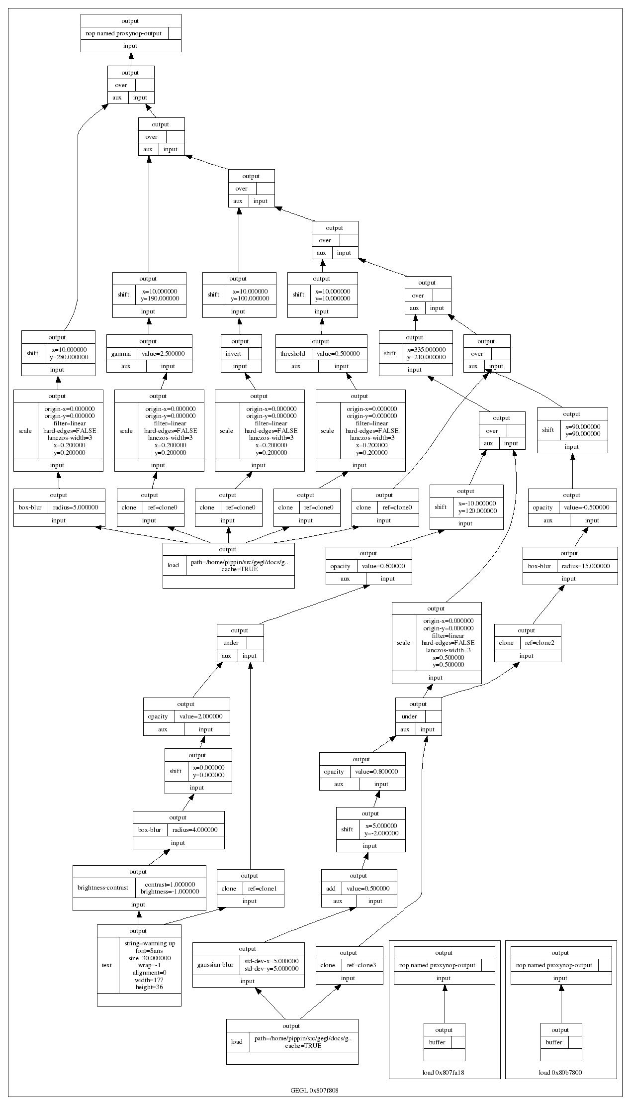
…and this is only a small one. Instead, here is the essence of it in four easy steps:
- there are input boxes that load an existing image, or render some vector shapes or text;
- there are chains of operation boxes that perform things like blur or change opacity of whatever gets fed into them;
- there are composer boxes that take two inputs and put one over the other, combining them in a certain way (think layer modes: normal, dodge, multiply);
- there are output boxes that either display the grand result on a screen, or export it to graphics file formats like png or jpeg.
so…great
Thus GEGL processes graphics by hooking up the boxes, inputs–to–output. Why does that matter? Well, because it is non‐destructive: the images in the input boxes are never modified.
If the structure of above graph is written to a file—apart from the input images, all other boxes are just snippets of XML—and a year later it is re‑opened in GIMP, then each of the operations and their parameters; each of the vector shapes or text can be freely changed. Even the input images could be swapped out for different ones. The result is a changed image composition, without any loss of quality.
It is exactly this promise of non‐destructive editing that played a big part in me joining the GIMP project years ago. I could see how that could lead to the end of some of the major workflow bottlenecks in today’s graphics software.
UI modelling
The integration of GEGL in GIMP is a disruption; it changes the rules of what one can do and how one can work. This is not a bad thing, it is a refreshing change. An interesting question is: how does the user interaction of GIMP have to change, in order to harnesses all this new power? In general there is a big urge, especially with developers, to just display the graph on the screen:
I call this the boxes and hoses model. If it looks familiar to you, it is because it has been around for decades: it is called visual programming. Which again explains why developers tend to choose this type of solution. One day a direct representation of the graph will appear in GIMP, as something extra. This is because the product vision defines GIMP as (also) being ‘a platform for programming cutting-edge image processing algorithms, by scientists and artists.‘
activity centre
To find out what the main UI in GIMP should be, we take from the product vision what the main activities are that GIMP is made for: ‘high-end photo manipulation’; ‘creating original art from images’; ‘producing icons, graphical elements of web pages and art for user interface elements.’
As a next step, it pays off to look at the nature of these activities. Users start with images or basic shapes (vectors) and apply image manipulation operations, one after another, to achieve the desired result. Users organise their work in layers and GIMP composites the result. Schematically that looks like this:
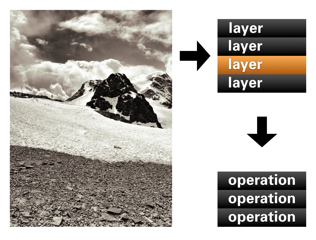
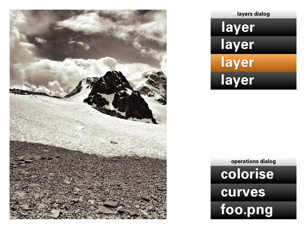
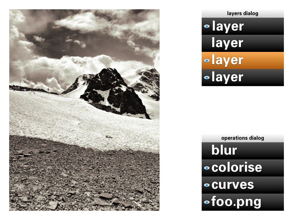
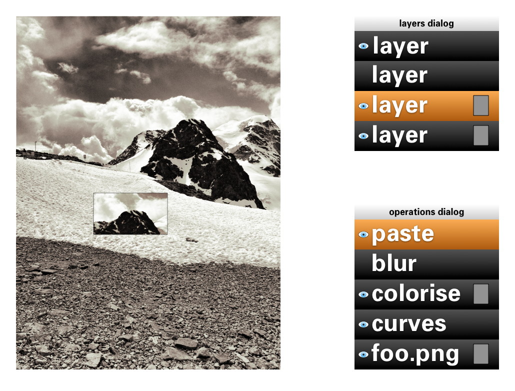
In short: a work (a composition) consists of layers, each with its sequence (in time) of operations. Now we got the start of a model for the UI. That list of layers we know already, as the layers dialog. The sequence of operations for the layer, we can call that the operations dialog:
- disclaimer
- Keep in mind that the user interaction shown in the image above, and all the ones below, is not a true mockup. It is more a diagram—with in part grotesque proportions—to show the principles of how the UI works.
We can see that the four GEGL elements are covered: The image material to start with: loaded pixels or rendered vectors; the layers that control the bulk of the compositing; the chains of operations; the output to the screen in the big image window.
Yes, the image window is the place for judging one’s work and for doing the actual work, hands‑on. The image window deserves a couple of times more screen space than any GEGL graph manipulation. Reversing this relationship (as shown earlier) is completely disregarding the nature of the activity.
back to the future
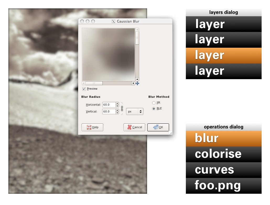
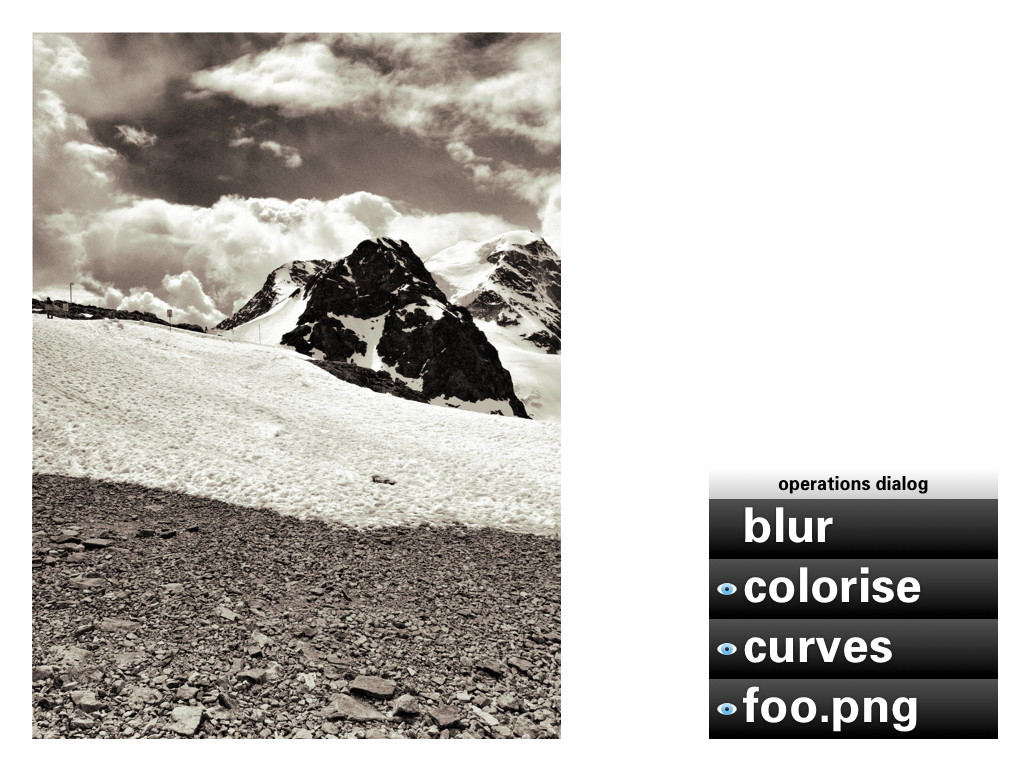
Adding an operation works as before: use a toolbox tool or invoke a menubar item. Here Gaussian blur is invoked and it appears at the top of the operations list:
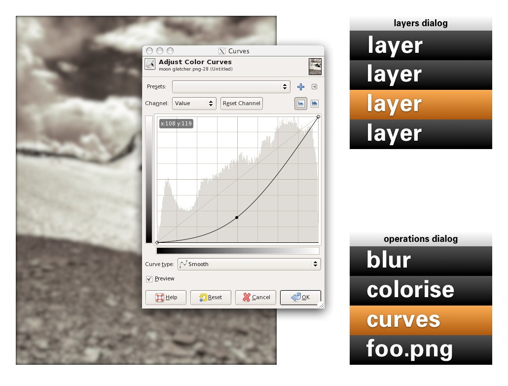
Now it gets more interesting: revisiting the past. No matter if it was done five seconds or five months ago, one can recall any previous operation applied to this layer and readjust it. Here the curves for this layer are revisited. While adjusting, the output updates through the complete chain of operations, including colorise and blur:
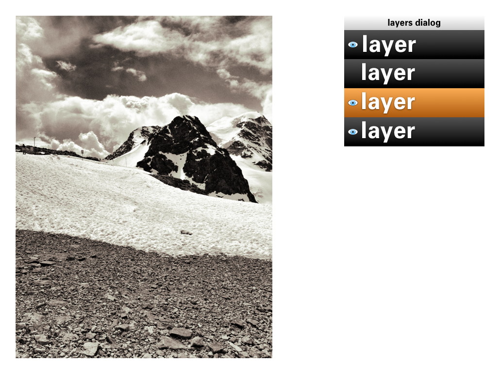
A lot of layers dialog behaviour can be reused for the operations dialog. ‘Eye’ toggles can be used to show/hide the operations:
Drag and drop can be used to rearrange the order of operations. The result of that may turn out to be more subtle than you think. Because GEGL processes everything in 32bit floating point, it will be much harder to get the rounding and clipping artefacts you get with 8‐ or 16‑bit integer processing. Only when an operation does not commutate by nature (i.e. the order matters), then it gets interesting to experiment with the order of operations.
Of course copy and paste of operations, between layers of the same or different files works. Dragging and dropping of operations on another layer copies or moves them, a modifier key (shift or ctrl) will sort that out. And before I forget: selecting some operations in the operations dialog and invoking ‘Make macro’ would be a good, natural way to get that started.
the holy trinity
Before we continue with more GEGL user interaction, here is a pop quiz. I took this b+w photo of the brilliantly named Kloten airport and coloured part of it red:
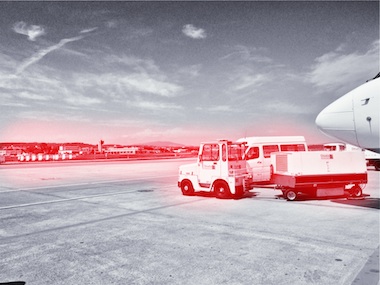
My question is: how did I apply that red?
- directly with a tool from the toolbox;
- making a selection, then invoking a menu item;
- using a layer with a layer mask.
Well, I have forgotten how I did it (it’s been a while) and you will never guess. My point is that it does not matter. All three methods listed above are a combination of an operation (apply red) and a greyscale mask, controlling where it is applied and how much. All three methods are fully equivalent, it does not matter to the software—or the viewer.
It does matter to users. Given the context, composition structure, the graphics material and the end‑goal, each user knows exactly which of the three methods she/he prefers. There is a million different use cases and only the individual user on the spot can take the right decision. It follows that each of the three methods is equally important and needs to be equally available to users. This I call the holy trinity of image manipulation.
pagan practices
However, at the moment, you quite often see the following: ‘if you want this feature, you’ll have to use it on its own, extra layer.’ This is layer abuse. I get misquoted on this so let me clarify: users never abuse layers, developers do. Here are some examples of layer abuse:
- the only way to do a non‐destructive operation is via an adjustment layer
- only one vector shape per vector layer;
- only one block of text on a text layer;
- the output of a filter plugin is always put on a new layer;
- the result of using a toolbox tool is always put on a new layer.
The problem is with ‘only,’ ‘always’ and ever more layers, whether users want them or not.
reformation
The abuse listed above is straightforward to fix. Quite a bit of it has to do with enabling users to redo or revisit the image manipulation. That is solved by the operations dialog.
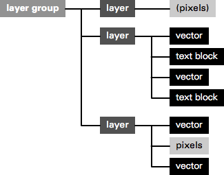
Furthermore, there can be as many vector shapes and text blocks on a layer as one likes. Just show them—and stack ’em—as sub‑layer elements in the layers dialog. And when then one of these sub‑layer elements is allowed to be actual pixels, then it is clear that the whole notion of special vector/text layer can disappear:
Layer abuse has to stop. Developers should never force users to use another layer. Only users decide how many layers they want to use, purely as their own personal way to organise their work.
more blessings
So apart from that no image manipulation is exclusive to a layer, what are further implications of the dogma of the holy trinity?
- paint with anything
- Yep, with anything, also all the plugins that appear in the Filters menu. Also the obscure ones that you and I, and anyone on the GIMP team have never heard of. Just dip your brush in it and smear it on the canvas. Thinking of combining it with paint dynamics just blows my mind. It just takes one tool (Filter brush?) to enable this.
- adjustment layers with anything
- You see, I have nothing against accomplishing things with layers. It is perfect when you got a collage made out of dozens of layers and then want to apply some treatments to the whole thing. It just takes one adjustment layer with any number of operations to get that done. Again, with anything.
behind the mask
As mentioned, all three image manipulation methods consist of an operation and greyscale mask, controlling where it is applied and how much. The interaction for these masks can be analogous to that of layer masks:
This means that both the parameters of the operation and also the ‘where and how much’ can be revisited and adjusted, a second later or a year later.
in triplicate
By now you may be thinking ‘wow, every image manipulation must be possible in three different ways, does that mean that one day GIMP will contain three times more stuff than today?’ Well no. I have already mentioned two measures—Filter brush, adjustment layers with anything—that will make large strides towards fulfilling the holy trinity. And even today the trinity is partially in place at GIMP.
Take for instance composition, putting pixels on top of pixels. Sounds like the exclusive domain of the layer stack, no? Well, even today you can use toolbox tools to do the same thing: the Clone tool and its 90%‑identical cousin, the Heal tool. And the menu item to compose is called Paste. Yes, the current layers dialog interaction while pasting should go. The GIMP team is agreed on this for years. Instead paste is an operation on the current layer:
weird science
There is a fifth element to GEGL graphs, that I have been keeping under wraps in this blogpost until now: cloning. This is taking an in‑between result in the GEGL graph, anything from a simple vector to a huge sub‐tree, and ‘teleporting’ one or more clones of this result to another position in the graph:

The original and the clones can have the same or a different position on the canvas; undergo the same or completely different operations; be composited in the same or a completely different manner. The magic is of course in that when the original (the input to cloning) is updated, every clone immediately updates, with all further operations and compositing applied on top. This is going to be liberating, because of the amount of work this saves.
Let me give an example. Let’s take the scan of a snowflake and fix it up with a number of graphics operations. We clone the result 99 times and spread these over five layers to compose our snowscape. We make ever flake a different size and a different colour. Already laborious, no? And now, we decide we are not satisfied with how refined the snowflakes are. Solution: fix the original with more/less/different/updated operations, all 100 flakes will immediately show the improved refinement—in their different sizes and colours.
send in the clones
My plan for the user interaction of cloning is to make it a variant of pasting: Paste as clone. This includes doing further operations on the pasted (as clone) material, before closing off the paste (you can always revisit the paste operation and modify all of it). And as Ville Pätsi pointed out a while ago, there needs to be a way from each clone to access the original. A button or link on the Paste clone operation in the operations dialog might do the trick.
There is more tricky stuff coming up with this cloning, like cloning layers or layer groups. And to go fully meta on this: I am asking myself why chains of operations cannot be cloned and applied to different input material. But Øyvind is not up for that.
two more things
To wrap all this up I have two benchmarks that have developed out of the GEGL discussions. They are alternate manifestations of the holy trinity and they are serious tests of the direction the GIMP user interaction is taking.
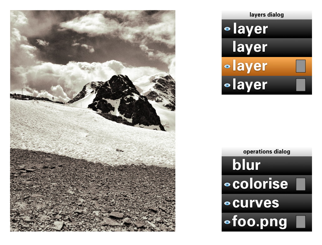
First, in a future version of GIMP, if users really envision their work as one single layer—not that unusual with photographs—then they will simply be able to close the layers dialog. Their work will not be impeded in any way by this, everything is still available to them (twice, as toolbox tool and menu) with no limits in the sophistication with which they can express themselves:
Second, in a future version of GIMP, if users are really not interested in switching operations on/off; rearranging operations or revisiting the past, then they will simply be able to close the operations dialog. Their work will not be impeded in any way by this, everything is still available to them with no limits in the sophistication with which they can express themselves:
You could even combine the two benchmarks and GIMP would still work, without a hitch.
aftermath
Directly after the lecture at the LGM, Øyvind Kolås pointed out one flaw, one thing I had not thought of: those greyscale masks, that play such a central role, are not pixmaps. They are GEGL sub‐graphs themselves. Which creates the possibility of near‐endless drill‐down: operations with greyscale masks, which contain operations with greyscale masks, which contain… et cetera.
Is that a fatal flaw? Is that going to blow up my plan to reduce the complexity of the GEGL graph to a linear list of operations? Do we just have to confront users with the whole graph? Let not kid ourselves about the complexity of that graph. In practice, I’d say that a simple GIMP file starts at ten times the number of boxes in the example at the top, quickly moving to a hundred times and then beyond.
not my problem
To developers—especially the ones that are working up to their elbows in GEGL graphs—this problem looks like one of navigating the graph and making edits. But to me it looks like another problem needs to be solved: how can users navigate their working context? Already today GIMP users are doing this navigation. Which layer, which layer mask are they editing, or is it the quick mask?
It will have to wait for another day, but when this context navigation is going to be designed, the one thing not to lose sight of is the image window. Everything evolves around it, including this navigation, and feedback of the working context has to be inside it. I certainly think we can do a better job than currently happens with the layer masks.
And when this context navigation has been designed, taking into account the holy trinity and the two benchmarks, then the operations dialog can show the simple list of operations performed in that context, in their natural order.
Labels: design stage, GIMP, GIMP redux, lecture, practical, product vision
If you like to ask Peter one burning question and talk about it for ten minutes, then check out his available officehours.
 Peter Sikking is an
experienced
Peter Sikking is an
experienced
interaction architect. He unabashedly puts
shipping great products at the centre of his design practice. He is known for
his work for Google, Nokia, the
Metapolator &
GIMP
open source projects,
and startups.
What is Peter up to? See his /now page.
- info@mmiworks.net
- +49 (0)30 345 06 197
- imprint
