10 reasons why you can’t morph a mobile into an iPhone
14 November 2007, 18:29
Last thursday was world usability day. The local event was a big hit, the auditorium was packed. At some point, there was standing room available only . Apart from helping with the organisation and presenting the morning session, I also lectured in the afternoon:
why one cannot morph a mobile into an iPhone (also not with usability)ps’s lecture at the berliner wud 07
Along with two spicy controversies in the title, I had chosen this topic to be able to share my analysis and hands‑on experience in this market segment. It was pure coincidence (I swear) that the following day the iPhone was launched in Germany…
You can have a look at the slides (pdf, 3.3 MB). But they contain big pictures, a couple of big words and no narative—like a good presentation should. So read on if you want to get the story…
161.000.000
That was last wednesday’s number of results for the word ‘iPhone’ in google. Today it is millions more. And that for something that was unknown on the first of January, 2007. How can it be that everybody writes and talks about the iPhone, even queues around the block for ‘a mobile’?
I will show now ten reasons why you can’t morph a mobile into an iPhone:
10. hardware
The most important piece of hardware of the iPhone is Steve Jobs. I am not trying to polish his already shiny ego. Instead, I am talking about his instinctive understanding that once a piece of software leaves the engineering department, user experience is everything.
To be able to produce inspired software, the top boss has to believe in great user experience and kick everybody’s ass to get it done. In huge companies a VP will do, but management below that level will be sidelined when trying to implement proper interaction architecture and usability processes.
leadership or bust
The upshot for interaction and usability specialist is that if you notice that your top boss is not actively supporting you, you might as well quit. Your work will be destined for somebody’s desk drawer for ever. Managers who totally believe in great user experience: you will have to rise to the top before you will get your way.
As for the top bosses: no general usability guidelines or usability testing of your current software will produce any greatness. If you do not feel how bad things are right now and are not prepared to kick ass, then forget about producing something as inspired as the iPhone.
9. product vision
When analysing an iPhone you will notice the conscience decision not to compete with blackberry & co. It is part of a clear product vision and this enabled Apple to take with confidence the decision to ditch the keyboard and go for touch screen. We will see that this was rewarded with plenty of room for joy in the UI.
Choosing what your software is not is one of the most difficult things for a development team to do. Avoiding tough decisions, ‘does everything, for everyone, with universal value’ is the usual outcome.
no vision, no product
I do not work on projects where the key people are not able to formulate a vision, with my help, within the first two days. There is then simply no basis for great interaction design. Without a vision, usability testing will yield trivial incremental improvement, nothing inspired.
8. (really) hardware
On the iPhone, the single hardware button that takes you to the home screen and the seventeen software icons on that screen that take you into applets, are an integrated system. That may sound normal, but too many times I have been asked to create new interaction architectures for hardware platforms that were already a fait accompli.
It is difficult to tailor UI for hardware that has a one button too many, or is missing one. If the hardware and software concept is not developed in tandem, the result will be and feel patchy.
software + hardware = one
From experience I can tell you that the hardware proximity sensor and accelerometer of the iPhone are simply vital for creating great software interaction with such a big touch screen. The iPhone is different from mobiles in that hardware and software form one single concept.
7. features
The iPhone has one third the number of features of a normal high‐end mobile phone. And that is not because they did not have the time at Apple to include the other 2⁄3. Instead, they made the necessary choices.
When I started working in the mobile phone industry, my colleagues told me that because of the immature market, competitiveness simply meant more features. Ten years later and the industry still has not grown up.

mature on features
This circle of dependancy is diabolic. Users and features are like children and candy. They never say no, even if stomach pains will surely follow. For developers, it is the easiest thing hand out. New features are a commodity. If you have no clue how to improve your software, you can always add new features.
One cannot achieve iPhone greatness if one is not prepared to make tough choices on which features really matter. This counts for any kind of software.
6. joy of use
I am not talking about gimmicks here, although the iPhone has a couple of them, like the big shutter when you take a photo. I am talking about traits of the UI that in two years time will still put a smile on your face. One of these is the screen–to–screen navigation, which fluently slides the new screen in and the old one out in one movement.
Not only does this improve usability by creating a connection between the two screens and using the directions to code forward, back, up/down a level type of navigation. It is also fast enough and has such elegant movement curves that it creates the experience of handling a smooth little machine, with great fit and finish. It has the quality of handling a Leica camera.
functionalism is not enough
Like traditional architecture, interaction architecture has gone through its functional phase where productivity was everything. And there is nothing wrong with bulldozing the time wasting interaction of big, ugly software that tends to be used in offices.
In this post‐modernist world, joy of use counts. Forgoing gimmicks and getting it right lends a quality feel to a software product.
5. display
Comparing the size of an iPhone screen to that of the original macintosh, we see that it is not that much smaller, 480×320 versus 512×384:

The original mac is where the desktop publishing revolution took place, people made posters and newspapers on those screens.
ambiguous device
A suspicion rises: is this a tablet computer or a mobile? The iPhone covers the middle ground in this regard. We will see the consequences.
4. paradigm shift
When designing applications for the iPhone you could try the mobile phone approach with grids, lists and all the actions in option menus. However, from experience I can tell you that is a dead end. The applications on the iPhone break away from the mobile paradigm.
A case in point is the web browser, where they ignored the mobile WAP browser and used the big screen to put a normal web browser, using the random access touch input for zooming and panning. A great experience, instead of a damp squib.
full use of full‑screen
‘Avoid mobile look + feel like the plague and use the whole screen’ is what I can recommend anyone developing for the iPhone. Only in that way one can achieve the required inspired interaction.
3. telephone?
Phone is one of seventeen icons on the home screen of the iPhone. It shares the ‘top shelf’ with iPod, email and web browsing. This illustrates that making call does not have absolute first priority.
We could go further and ask ourselves why is it called an iPhone? iWhatchamacallit would be more appropriate.
don’t call it a…
The iPhone is a Trojan horse. At Apple they sidestepped the question of creating a better mobile by creating a modern communication device that happens to make calls and send SMS’s, then stuck the phone label on it to get it adopted.
2. holistic
Although it is a fuzzy, vague term, holistic does apply to the iPhone. In the eight preceding points, we have seen how everything fits together. Sure, dozens of persons worked on the iPhone, but the result feels as though it was created by a single hand.

simply holistic
This holistic user experience is the key to simplicity. ‘Don’t make me think’ is achieved via seamless continuity starting with leadership, product vision, via hardware, 1⁄3 of features, ending in paradigm shift and joy of use.
1. jump factor
Below we see every mobile ever made cluster together on the left and the iPhone as a lonely star on the right:
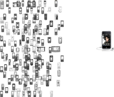
Incrementally improving a mobile so that it leaves the cluster and approaches the iPhone is impossible. It is actually easier to join the iPhone’s position from above, below or the right. The only way to get there, is to jump.
conceptual innovation
The jump factor needed is innovation, which is by nature a conceptual undertaking. Given the right leadership, product vision and 1⁄3 of features, interaction architects are able to make that jump and deliver a great user experience.
Usability is by nature empirical. This works great to obtain the input that interaction architects need: facts on the table, I always say. Also user testing is useful to validate interaction concepts. Interaction architecture and usability are two complementary disciplines that can deliver the validated innovation needed for iPhone greatness, under the right circumstances.
Labels: architects, fundamental, lecture, mobile, product vision

![]()
![]()
1 comments · post a comment
- at 11 December, 2007 10:10,
 commented
 - People were raving about the iPhone before the specs were out. (It's called the Jesus Phone for a reason.) The useability of the device is not what sets it apart.
If you like to ask Peter one burning question and talk about it for ten minutes, then check out his available officehours.
 Peter Sikking is an
experienced
Peter Sikking is an
experienced
interaction architect. He unabashedly puts
shipping great products at the centre of his design practice. He is known for
his work for Google, Nokia, the
Metapolator &
GIMP
open source projects,
and startups.
What is Peter up to? See his /now page.
- info@mmiworks.net
- +49 (0)30 345 06 197
- imprint
